
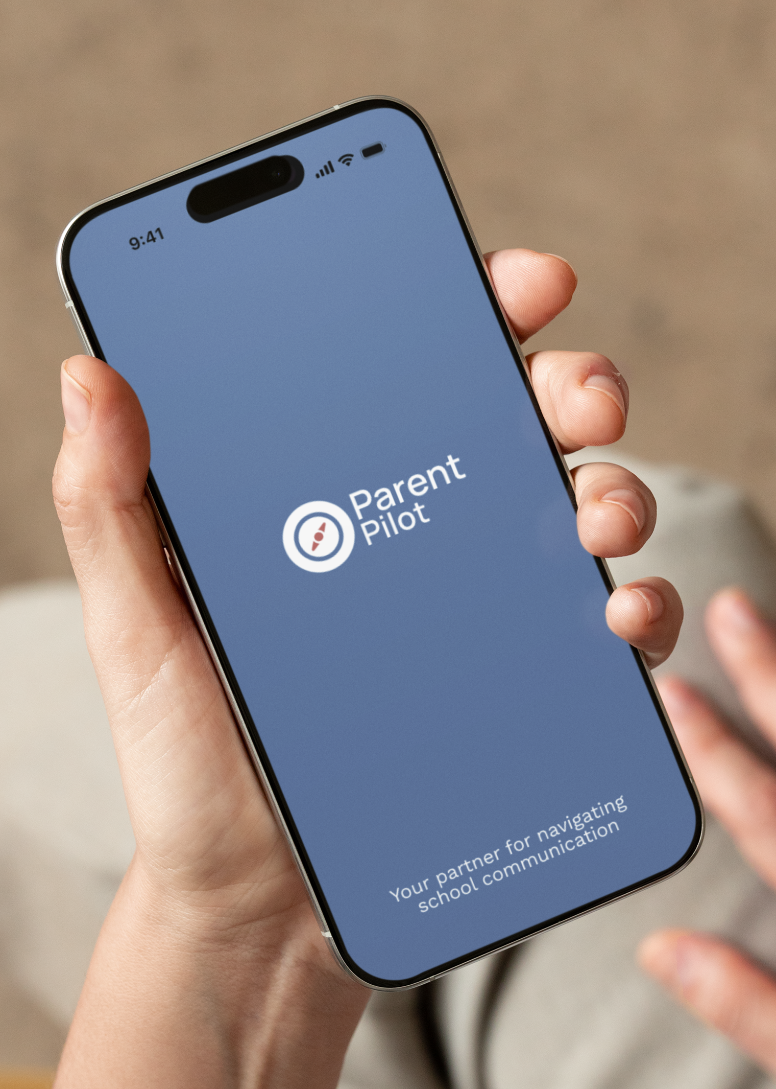
Case Study: Parent Pilot - guiding parents through school communications
The Challenge
Parents are overwhelmed by fragmented school communications scattered across emails, portals, and group chats. Without a central, mobile-friendly system, important updates get lost—leading to stress, missed deadlines, and the constant sense of playing catch-up.
“I’m missing important information from school because I’m tuning out all the noise.”
Role: UX Research & Design
Tools: Figma, Figjam, UX Pilot
Deliverable: An end-to-end working prototype supported by in-depth qualitative research insights and a complete set of UX artefacts
Team: 1 designer and UX researcher
Project Duration: Oct 2024 - Feb 2025
The Solution
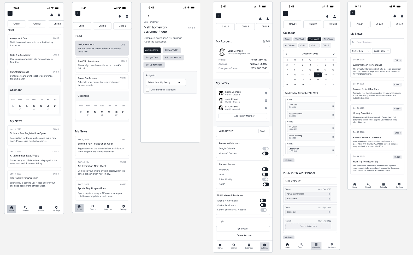
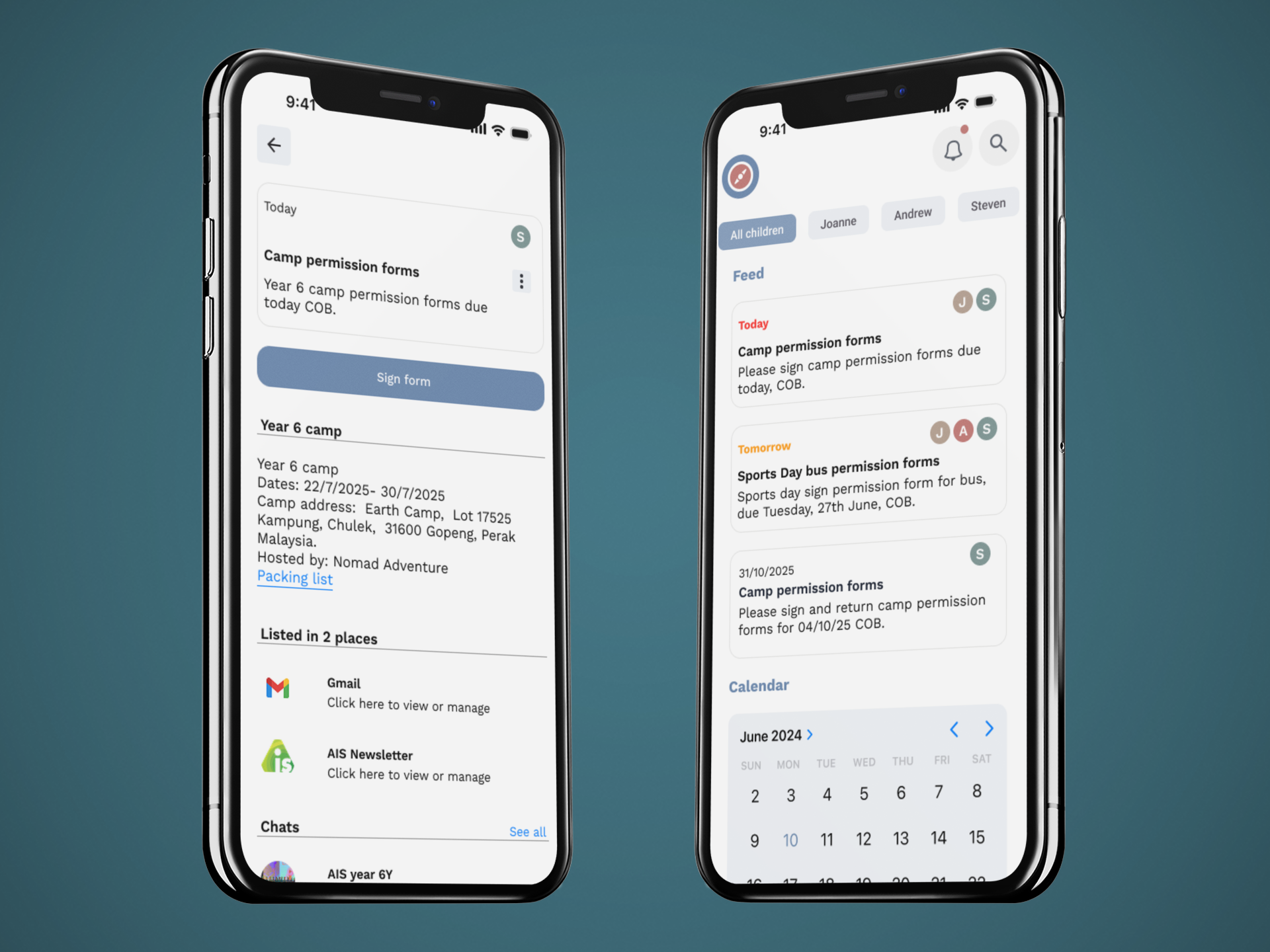
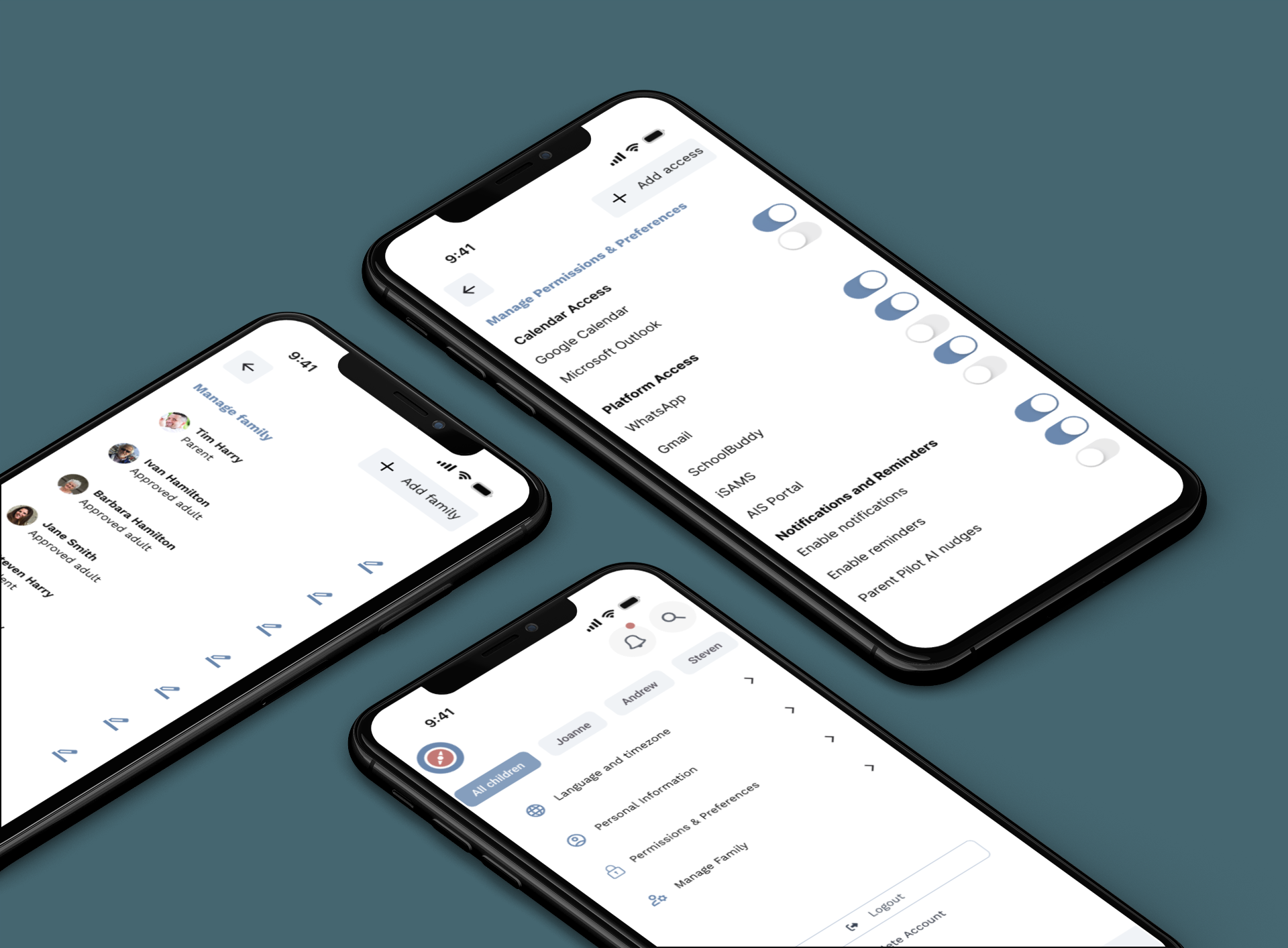
I designed Parent Pilot, a mobile app that brings all school communications into one place. At its centre is an action-based to-do list that helps parents cut through the noise, sync with calendars, assign tasks, and keep school life organised easily.
Scope
Over four months, I led the process end-to-end including interviews, competitor analysis, affinity mapping, wireframing, and usability testing. This case study shares my process in designing an intuitive, user-centred solution.

User Research
To understand parents’ pain points, I carried out in person user interviews, competitor analysis, and used affinity mapping to categorise behaviours. These methods revealed consistent patterns and challenges that shaped how I moved forward with the design. The research informed the personas, leading to clear project goals, and feature priorities. Beneath the frustration, the research uncovered clear problem areas. These insights highlighted not just functional needs, but also the emotional drivers—parents wanted to feel in control, reduce mental load, and support their children without burning out.

Core Values
Clarity - Delivering the right information at the right time — no noise, no confusion
Trust - Parents can rely on us for accurate, secure, and timely school updates
Simplicity - Every touchpoint is designed to be intuitive, streamlined, and stress-free
Relevance - Filtering out the noise and surfacing only what matters to each family
Personalisation -Tailoring the experience to you— because every family is different

Competitor Analysis
A competitive review of six leading school–parent communication apps revealed a clear gap:
None provide a really centralised, parent-focused experience
Existing tools rely on school adoption and emphasise behaviour/learning over organisation
Only one supports multi-school families
None offer task-based organisation or aggregate information across channels.
This showed a real need for a tool that cuts down the noise, helps parents stay organised across all their kids, and makes school life easier to manage.
Key findings:
Centralisation is vital: Parents want one hub for all updates, customised by child, with calendar syncing.
01
Too much noise: Multiple channels cause overload and missed updates.
02
Manual workarounds: Parents re-enter information into personal calendars; they want one-click actions.
03
Notifications need hierarchy: Urgent, actionable items must be surfaced.
04
Personalisation matters: Profiles, filters, and colour coding reduce clutter.
05
Ease of use is essential: Parents expect a simple, mobile-first experience.
06
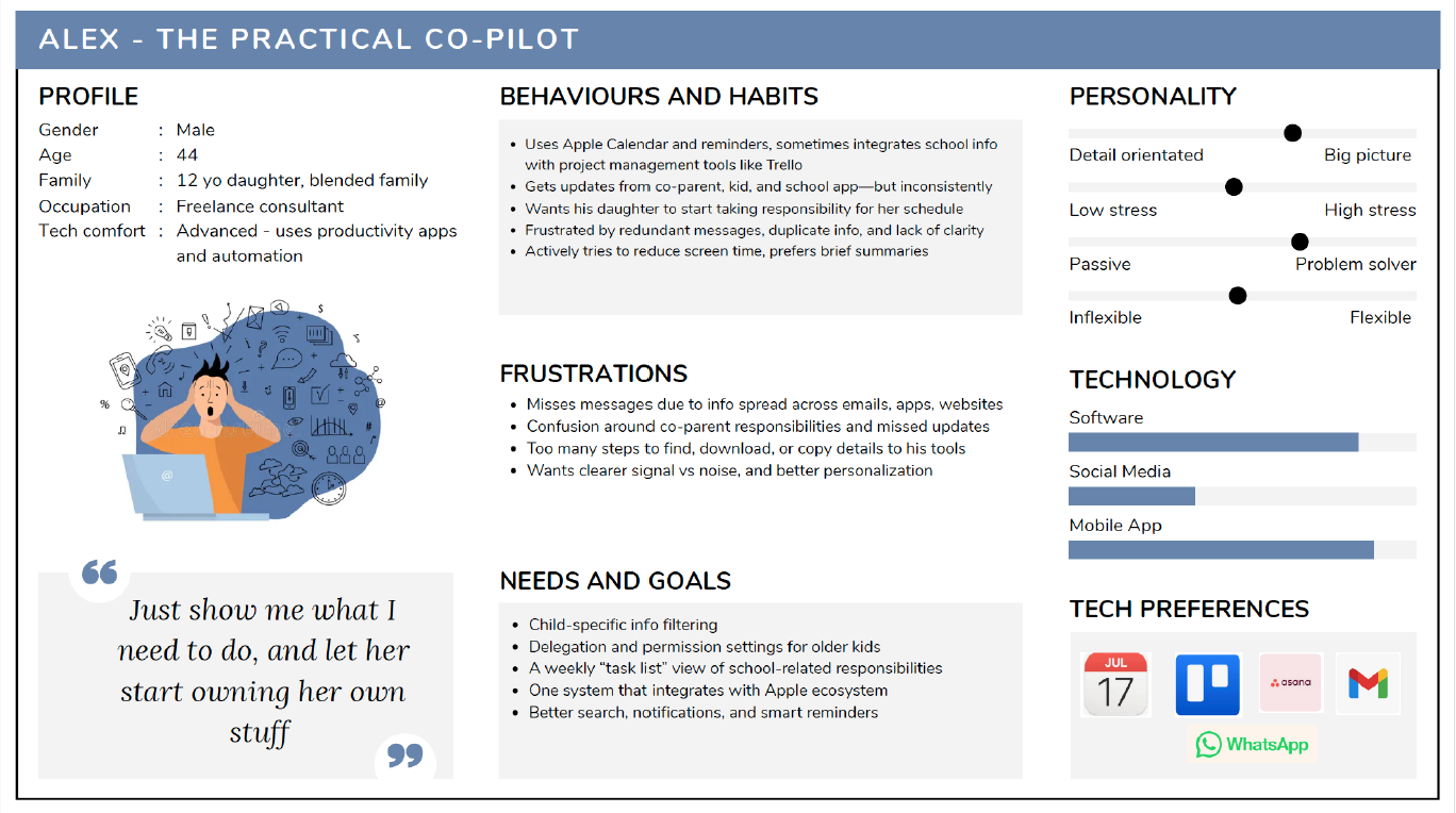
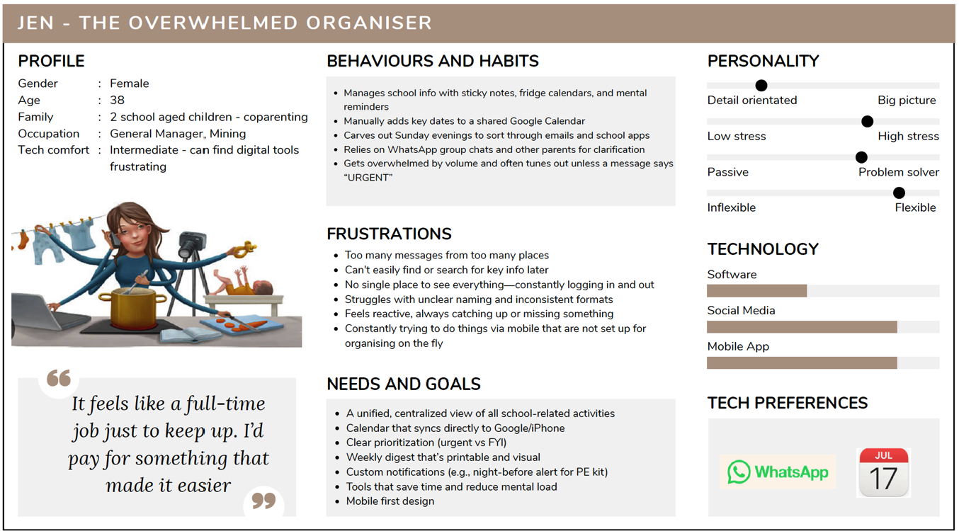
Based on the research I created two user personas that represented the core behaviours and frustrations uncovered in the research. Translating these insights into personas helped clarify who I was designing for and why: Jen, the overwhelmed multitasker seeking simplicity and clarity, and Alex, the digitally fluent parent who values efficiency and automation. These personas grounded every design decision, ensuring the solution directly addressed the real challenges parents face daily.
User personas
Ideation and Design process
I explored both school-specific apps and everyday tools parents use—like WhatsApp and digital display calendars—to understand familiar behaviours and expectations. From this research, I prioritised features such as an AI-powered information filter, action-driven to-do lists, and customisable task views. These insights shaped the site map and guided a solution that stays simple, intuitive, and aligned with parents’ real needs.
In the design phase, I focused on reducing noise and creating a clear, supportive experience. Through iterative wireframes, user flows, and mid-fidelity prototypes, I refined navigation, task hierarchy, and calendar interactions. Usability testing confirmed what felt intuitive while revealing areas to streamline, such as task clarity and urgency cues. This process informed a calm, organised visual direction with clean typography and familiar interaction patterns.
Step One
Design approach
Using the concept of “less noise, more clarity”, I stripped back features to focus only on what parents needed most.
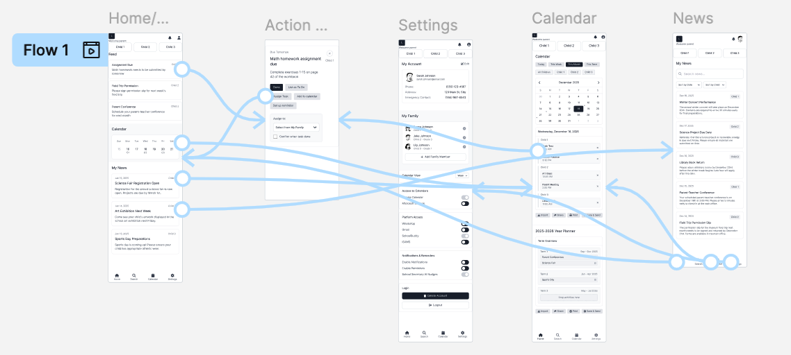
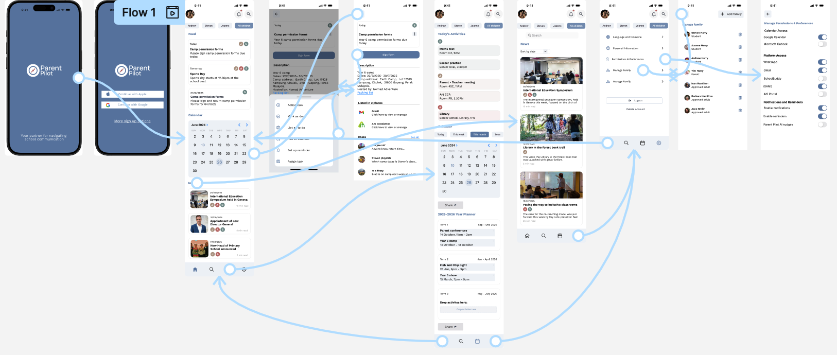
Wireframes & user flows tested different layouts for the feed, calendar, and tasks.
Low-fi prototypes using UX Pilot allowed me to iterate quickly testing layouts and navigation patterns.
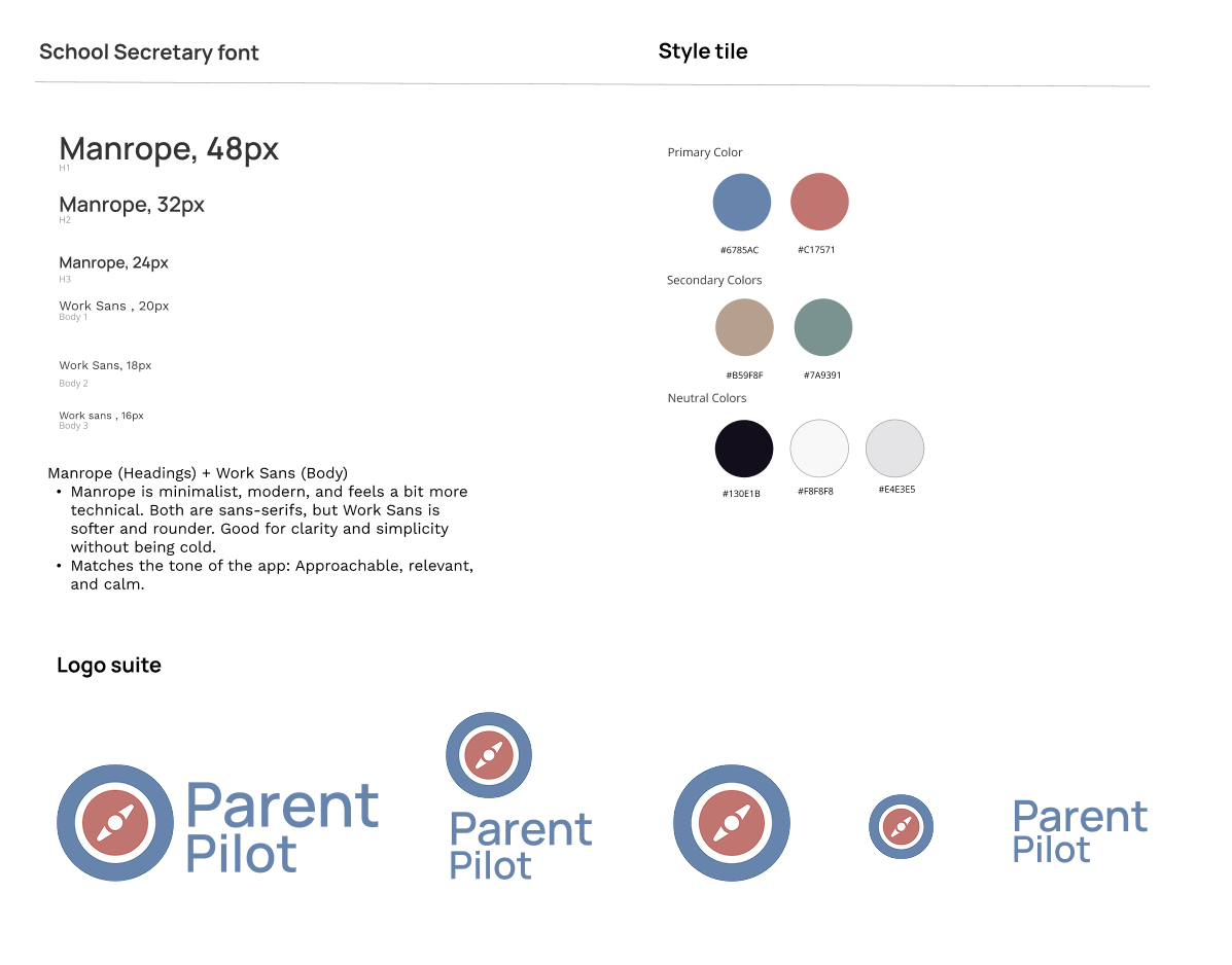
Visual design: I took inspiration from familiar tools like WhatsApp, with calm colours and clean typography to make the app feel supportive and professional not overwhelming. (examples here of mood board and style tile)
Logo & branding: a stylised compass works with the name to reinforce the idea of guidance and navigation. (examples here)
Step Two
Usability testing
I ran mid-fidelity usability tests with six parents of school-age children to evaluate functionality, clarity, and ease of use and completing tasks across the feed, calendar, and settings.
What worked well:
Easy, intuitive navigation
Urgent tasks floated to the top
Flexible calendar views
Personalisation options (filter by child, assign/share tasks)
Clean, uncluttered design
Areas to work on:
Clearer separation of tasks vs news
Stronger urgency indicators and deadlines
More intuitive family management
Options like archiving news and adding task contacts
Removal of features drag-and-drop in the calendar and prominent delete buttons, confusing or unnecessary for an MVP.
Step Three
Prototype testing
Prototype Testing
Tested the high-fidelity prototype with parents to evaluate real-time information access and reactions to key features like child-specific profiles, filtering, and centralized views.
Goal: ensure parents could quickly find and act on school information with minimal friction.
Results
All participants completed tasks successfully and rated the app highly for clarity and ease of navigation. The feed, calendar, and task management were intuitive and helpful—especially filtering by child, highlighting urgent tasks, and assigning/sharing responsibilities. Parents said they’d use the app regularly to stay organized and reduce overwhelm.
Strengths
Clean, uncluttered interface
Clear feed separation between urgent tasks and news
Flexible calendar views (daily + overview)
Personalization for multiple children/family members
Simple, intuitive icons and navigation
Areas to Improve
Improve task clarity (titles, deadlines, urgency indicators)
Labelling to make calendar layouts easier to use
More intuitive family management (clearer edit/add)
Extra features: news archiving, task contacts, more detailed task information
Impact
The testing confirmed that Parent Pilot’s core experience works well and feels supportive, not overwhelming. Feedback provided clear next steps for iteration—focusing on clarity, consistency, and small improvements to detail—helping move the design toward a more polished, family-friendly tool.
Reduce noise & surface what matters
Design priority 1
Parents weren’t just overwhelmed—they were filtering out communication entirely because of constant noise across emails, portals, and group chats. The first design priority was to cut through this overload by centralising information in one hub and clearly separating actionable tasks from general news. Urgent items needed to stand out, with deadlines and priority cues surfaced automatically to prevent missed updates. This focus on clarity shaped features like the action-based to-do list, AI-assisted filtering, and child-specific views, ensuring parents could instantly understand what required attention and act without digging.
Personalised, child-specific organisation
Design priority 2
Because every family manages school life differently—and often across multiple children—the second design priority centred on building personalisation into the core experience. Parents needed flexible ways to organise information that matched their routines, digital habits, and mental models. Features such as child-specific profiles, colour coding, filtering, and assign/share functionality allowed parents to tailor the app to their family structure. Calendar syncing, custom views, and adjustable task layouts further supported individual preferences. This level of personalisation ensured the app adapted to the parent—not the other way around
Final Thoughts and takeaways
This project showed me the power of human-centred design to reduce mental load and give parents back time and headspace. The biggest challenge was balancing simplicity with flexibility—delivering an uncluttered experience while still allowing for personalisation.
Looking back, I would involve a wider range of parent voices earlier to capture a larger range of digital habits. Going forward, there’s room to improve features like notifications, task confirmations, and family management, while exploring how AI could make the app even more proactive and useful for parents.
I’m proud that Parent Pilot not only addressed a complex problem, but also resonated with users as something they could see themselves using every day. For me, the key takeaway is that successful design isn’t just functional; it’s about creating experiences that genuinely make life easier.