
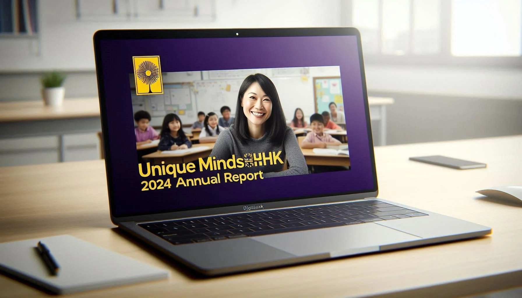
Case study: Creating a responsive website for an education charity - UniqueMindsHK
The Challenge
UniqueMinds HK is a new charity supporting Special Educational Needs (SEN) in Hong Kong public schools. Currently without a digital presence, they are struggling to establish credibility and legitimacy—especially in a competitive, culturally sensitive space where donors and investors are looking for proven results.
Role: UX Research & Design
Tools: Figma, Figjam, UX Pilot
Team: 1 designer - myself
Project Duration: Feb 2024 - May 2025
Deliverable: A working, responsive website that can be used by the client to engage with potential funders.
The Solution
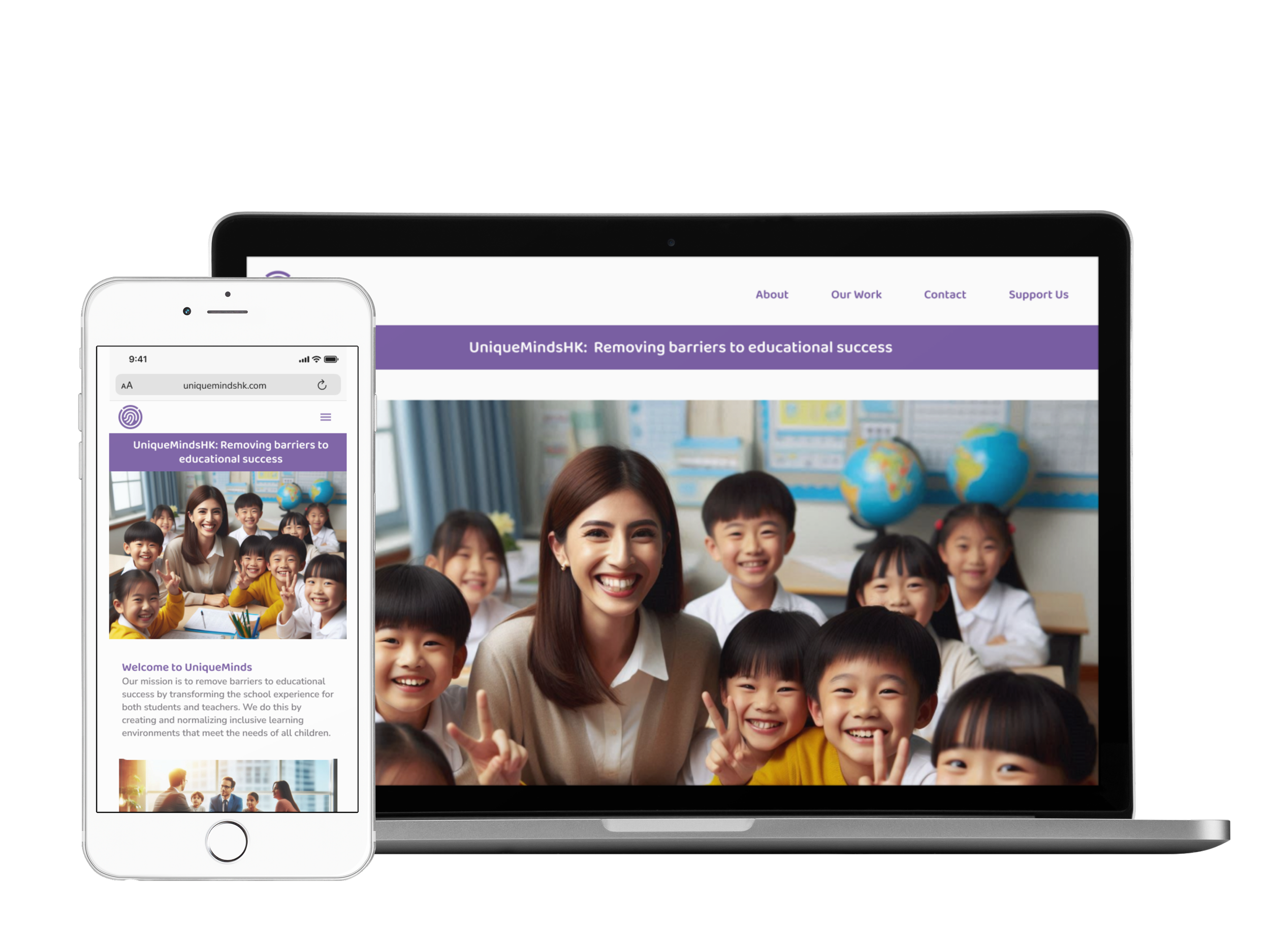
I designed a responsive website that positions UniqueMinds HK as a credible and professional charity by clearly communicating their mission, impact, and expertise to donors and investors.
The site builds trust through transparent financial details, clear program information, and easy access to the organization’s leadership. A fun, engaging and cohesive visual identity strengthens the brand and supports stronger recognition.
To meet the client’s long-term goals, the design is also scalable to take into account future content for school partners and parents, meaning the platform can evolve as the organization grows its reach and impact.
The Scope
Over three months, I worked closely with the client to define their core needs and translate them into a focused, strategic website. With a tight launch timeline, I prioritized research that would help the organization build trust despite having no established track record. I conducted stakeholder interviews, competitive analysis, and looked at the broader cultural, political, and educational landscape surrounding SEN in Hong Kong.
I then compiled the findings through affinity mapping, moved into wireframing and usability testing—refining the work based on feedback. This case study outlines how these insights helped me create a website design that supports the organisations current needs, fundraising, but also allows for future growth as their needs change.
User Research
To understand the motivations and concerns of key audiences, I held interviews with potential donors, educators, and investment professionals, additionally I explored competitor analysis and behavioural grouping through affinity mapping.
These methods showed consistent needs around credibility, transparency, and ease of engagement—influencing personas, design priorities, and the website’s communication strategy. The research ensured that the solution not only informed users but also built confidence in UniqueMinds legitimacy and ability to impact.

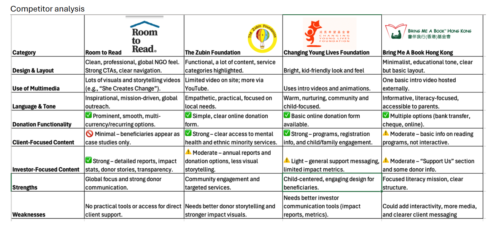
Competitor Anaylsis
To understand how emerging charities and education-focused organisations build credibility, I analysed competitor websites across the nonprofit and SEN landscape. This helped identify common trust-building patterns, gaps in transparency, and opportunities for clearer storytelling—insights that shaped the site’s communication strategy and donation pathways.

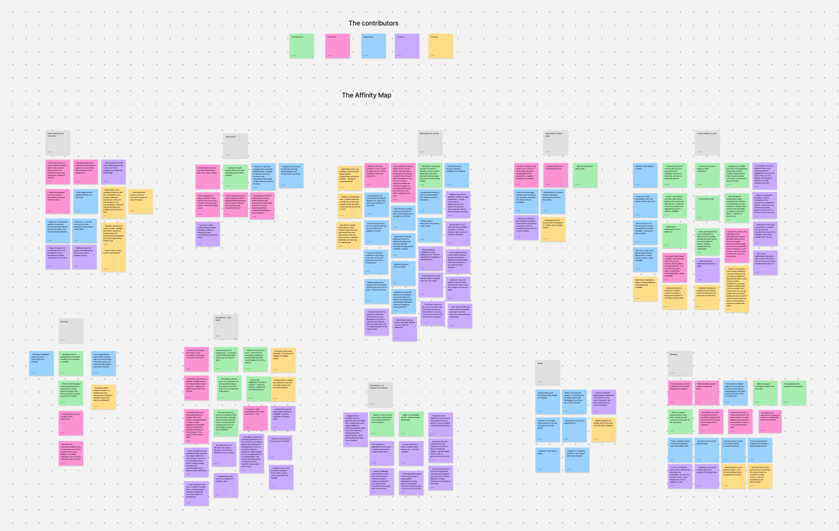
Behavioural Grouping
Using affinity mapping, I organised themes from interviews to uncover behavioural patterns among donors, educators, and investors. Grouping their motivations and concerns revealed shared needs around clarity, legitimacy, and ease of engagement, which directly informed the personas, content priorities, and design decisions across the site.
Key findings:
Potential donors and partners typically hear about new charities through personal networks, then look to the website to validate credibility. A website is expected to establish legitimacy by clearly communicating the mission, impact, and evidence of need—supported by transparent reporting, credible team members, and recognizable affiliations.
01
Users want quick access to what makes the organization different who is involved, and how to contact or support the charity. Emotional storytelling (videos, testimonials) combined with impartial statistics builds both trust and connection. A professional, easy-to-navigate design with current information and clear calls to action is essential, while lack of transparency, unclear goals, or missing data raises immediate red flags.
02
Two user needs stood out:
• Corporate philanthropy partners wanted evidence of legitimacy, measurable outcomes, and alignment with community/government goals before engaging.
• School administrators needed reassurance that the program is practical, low-pressure, and successful in similar local contexts.
03
These insights shaped my design choices, focusing on building trust, clearly showing what makes the charity unique, and making it easy for users to explore and connect. I kept in mind questions about transparency, creating an emotional connection, making information easy to understand, and ensuring the site could grow in the future.
04
Ideation and design approach
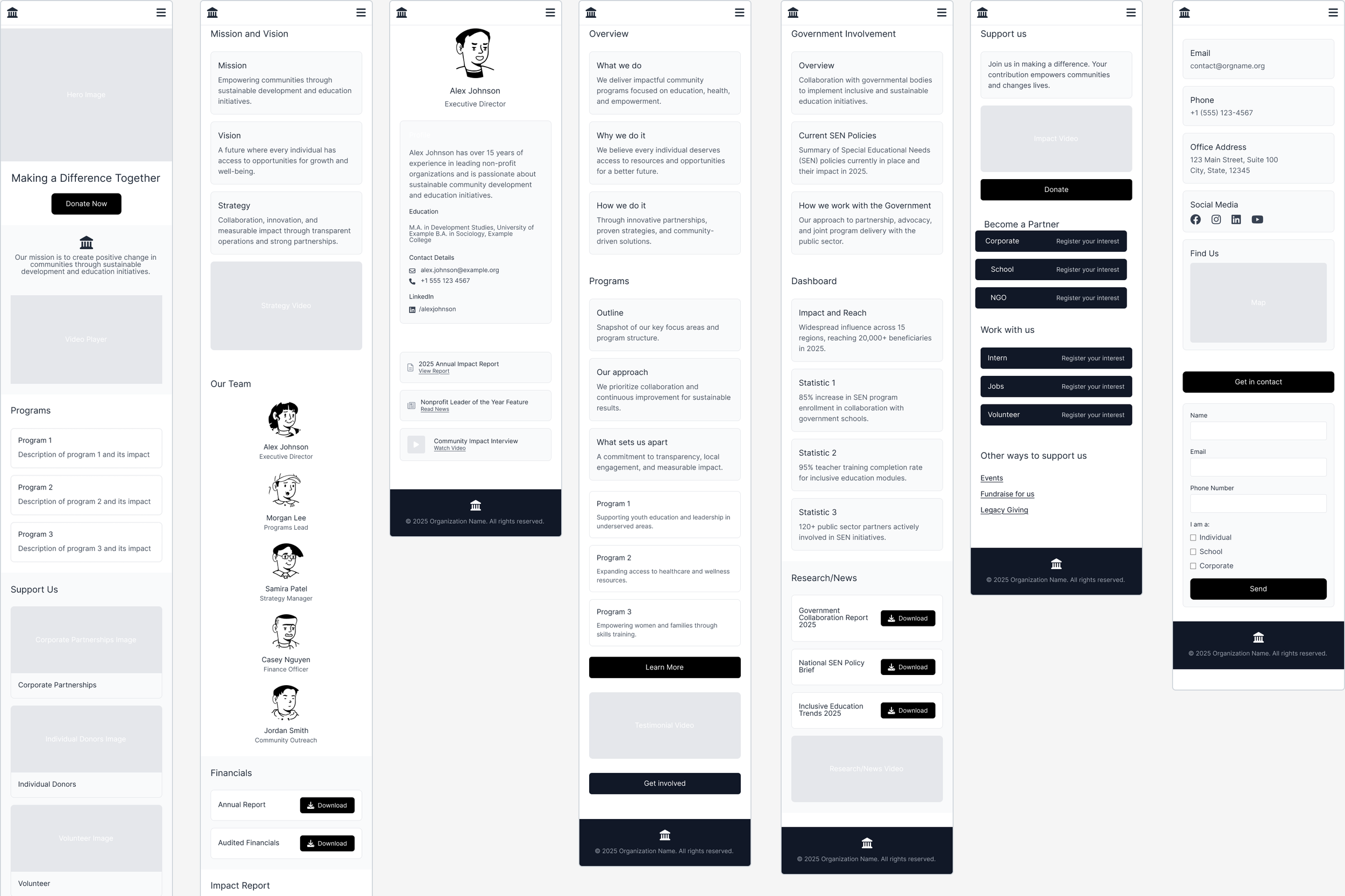
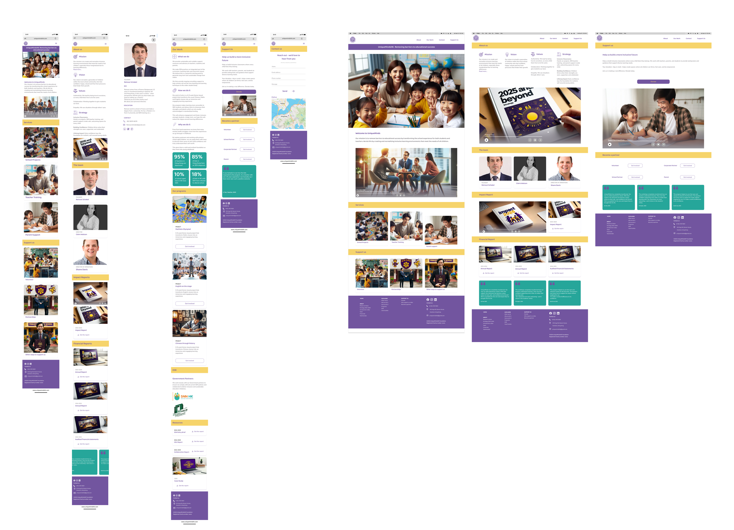
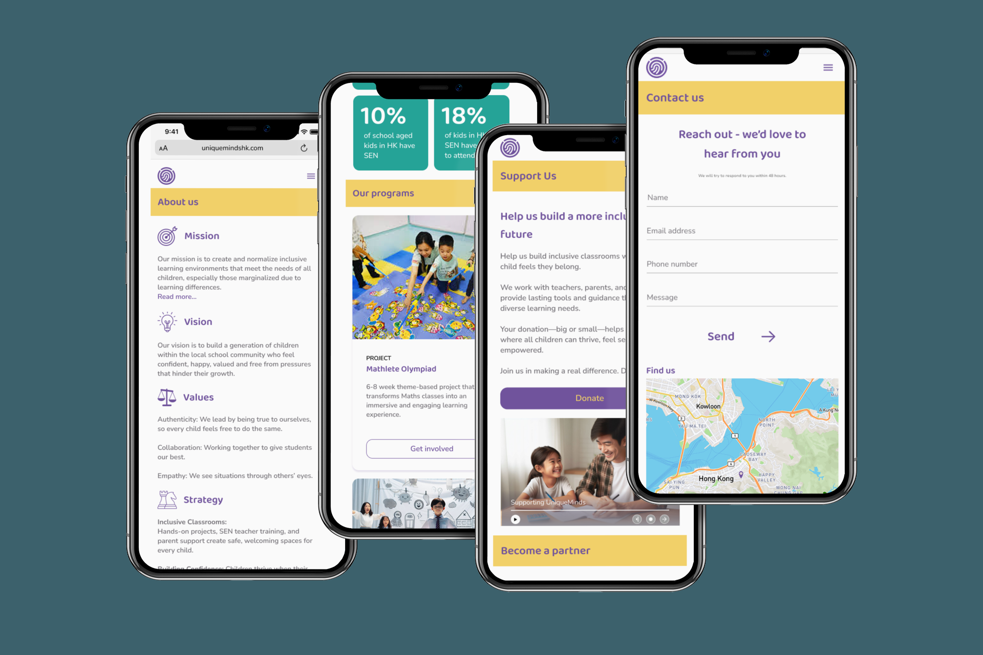
Using research, audience needs, and client priorities as a guide, I mapped out potential website features into a phased plan that delivered credibility right away while leaving room for future growth. The first phase focused on essential pages—Home, Team, Financial Reporting, Contact, About, Program, and Partners—to clearly explain the organization’s mission, highlight expertise, and build trust. Later phases included features like a Donate button, upcoming Projects, and Online Meeting Bookings to encourage engagement, as well as “surprise and delight” elements like tax receipts and educational resources for parents and teachers.
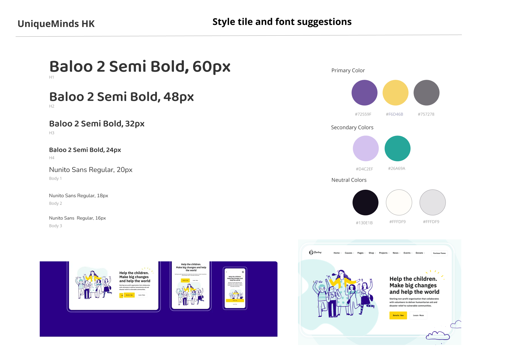
I looked at other Hong Kong charity websites and worked with an education philanthropy specialist to prioritize features that would most strengthen credibility and clarity. The client’s colour palette of purple and yellow, also helped guide early visual ideas, keeping the brand consistent from the start.
Usability Testing
Goal: Evaluate how clearly the website communicates UniqueMinds’ mission, strategy, team, financial transparency, and contact pathways for corporate partners.
Method: Figma prototype tested with 5 users from corporate and philanthropy backgrounds.
Step One
Key tasks
Understand what the charity does and why it matters
Find goals, team info, and financial reporting
Assess trustworthiness and professionalism
Locate the right contact person
Compare mobile vs desktop experience
StepTwo
Key insights
Clarity & Trust: Users found the mission, team bios, and financial info clear and trustworthy. Average confidence: 4/5.
Navigation: Easy across desktop and mobile; straightforward menus and consistent layout.
Content Confusion: Some headings (e.g., “Projects” under Support Us) and statistics placement caused minor confusion.
Design Feedback: Colours, imagery, and videos were engaging; overall clean and modern.
Step 3
Major changes implemented and future enhancements
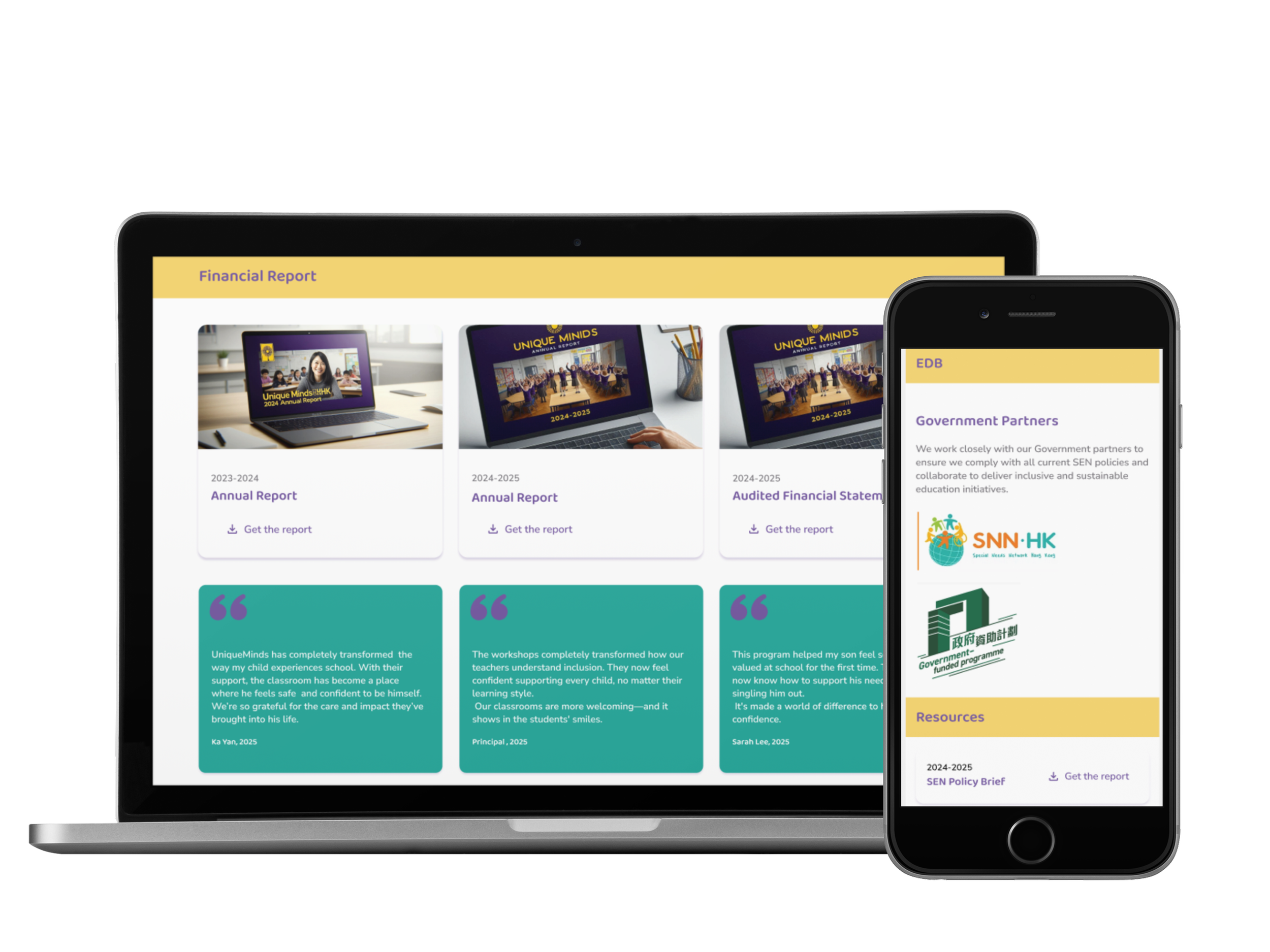
Home: Clarified “Support Us” section, distinguishing services vs ways to contribute
About & Our Work: Moved statistics to Our Work; separated Impact and Financial Reporting; aligned icons with headers
Support Us: Updated audience labels (Parents, School Partners, Corporate Partners); shortened text for faster Donate access
Contact: Removed redundant info; moved contact form to top; refined copy for professional tone
Outcome
Next steps for the project would be to:
Include more project outcomes, case studies, and measurable impact
Highlight tax-deductible status and key partnerships on the homepage
Expand founder credentials and social proof to strengthen credibility
The site is clear, professional, and trustworthy, with a consistent desktop and mobile experience. Iterations improved navigation, clarity, and credibility, making the site more compelling for potential partners.
Design priority 1
Build Instant Credibility for a New SEN Charity
Because UniqueMinds HK was launching without an established track record, the first design priority was to build trust quickly and clearly. Insights from interviews with donors, educators, and corporate professionals showed that credibility hinged on three things: transparent financial information, clear visibility of the leadership team, and evidence of external validation such as government support or reporting.
These findings shaped the site’s structure and content strategy, ensuring that users could easily verify the organisation’s legitimacy and feel confident engaging or donating.
Design priority 2
Make the Charity Simple to Understand and Easy to Engage With
Beyond building trust, it was important to make sure people could quickly grasp what UniqueMinds HK does and how they can get involved. From the research, donors, schools, and corporate partners all wanted the same thing: clear information, easy navigation, and obvious next steps. So the design focuses on keeping things straightforward—clean pages, simple language, and clear calls to action—so users don’t have to hunt for details. The goal was to remove friction and make it easy for anyone to learn about the charity, see its impact, and feel confident reaching out or offering support.
Key Takeaways
Keep checking back in with what users and the client actually need — it keeps the design on track.
Test early and often, especially when the goal is to build trust and show credibility.
Work within the limits of the project, but design in a way that allows the product to grow later.
Communication is a priority! Listen actively and openly when communicating with clients to help them turn their ideas turn into real, practical design decisions.
Provide solutions – not problems.
This project showed me how thoughtful design can help a young charity stand confidently next to more established voices— creating a digital presence that feels credible, welcoming, and ready to make a difference. It was rewarding to see how design choices can support their story and help them connect with the people who believe in what they do.
Final Thoughts
This project was a key experience in my growth as a UX designer because it allowed me to see how research, ideation, and design come together in a real-world context. Working with a real client made it easier and more meaningful to turn their needs into a complete website. Exploring AI to create imagery where the charity had no existing assets, and seeing how thoughtful design could help a new organization build credibility from the ground up was a new experience. I especially enjoyed working on a project whose subject matter I am passionate about.
The biggest challenge was managing deadlines for both the client and the Design Lab while working with a brand-new organization that had little history. This meant sometimes making decisions on my own and focusing on a simple, flexible design that could grow as the charity developed. Research was key, especially understanding how donors, corporate partners, and schools judge credibility. The challenge wasn’t finding new insights, but finding creative ways to show trust and transparency through design—using general statistics, testimonials, and easy-to-access financial information.