
Case Study: AmSpec’s Rebranding Journey
AmSpec has grown steadily over several decades, expanding its services across energy, agriculture, renewables, marine, and minerals. As the company evolved, so did the expectations of its clients and the competitive landscape. While the AmSpec name remained strong and respected, the broader brand system had not kept pace with the company’s growth or the modern design standards of its industry peers. This created an opportunity to reassess how the brand communicated expertise, innovation, and trust.
Role: Marketing and Communication Consultant
Team: Graphic designer, Marketing Communication Manager
Project Duration: June 2022 - Nov 2022
From:

To:
The Challenge
A comprehensive review of internal company feedback as well as information collected from external sources revealed several areas that pointed to the need for a rebrand. The visual identity—particularly the logo, colour palette, and iconography—felt dated compared to competitors like Intertek, Dekra, SGS, and LRQA, all of whom had recently invested in strong, contemporary brand updates. AmSpec’s own visual assets had become inconsistent over time, with multiple icon styles, varying colour usage, and no overarching tagline to unify messaging. As the company continued expanding into new markets and sectors, the existing brand risked limiting its ability to stand out and communicate clearly.
The rebranding initiative aimed to:
Modernize the visual identity while preserving the equity of the AmSpec name
01
Create a cohesive, consistent brand system across all divisions
02
Differentiate AmSpec from competitors through a stronger, more contemporary design language
03
Introduce a clear, memorable tagline that reflects the company’s mission and expertise
04
Align the website and digital presence with updated brand standards
05
Ensure the brand could scale across sectors, regions, and future services
06
Brand audit & insights
The audit examined every core brand element:
Company Name: Strong and recognizable; no change required.
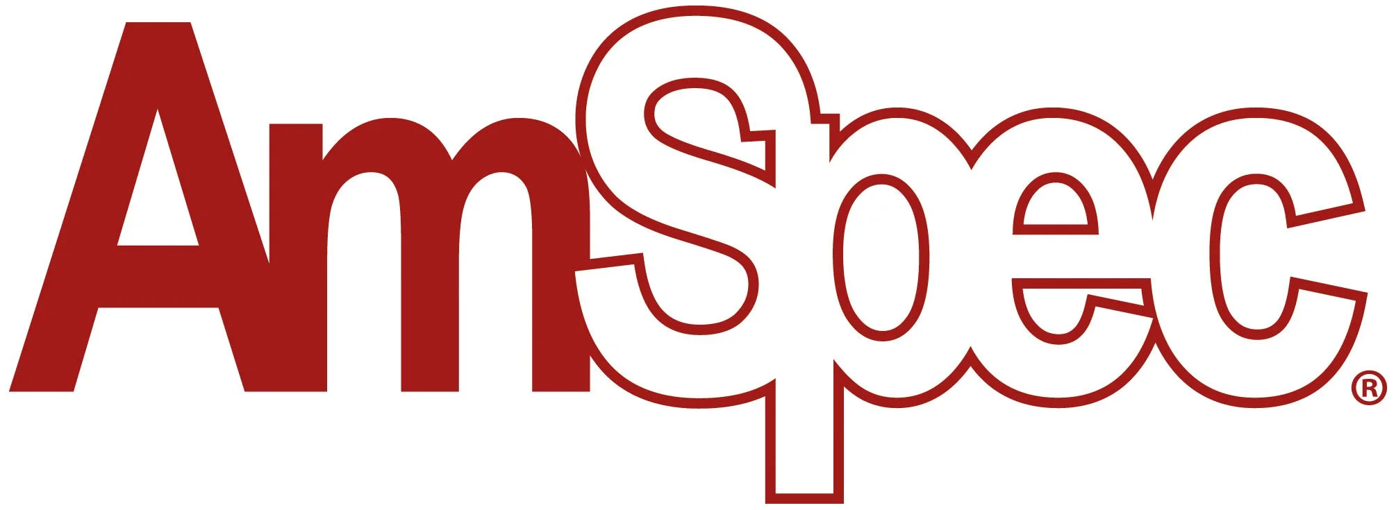
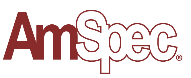
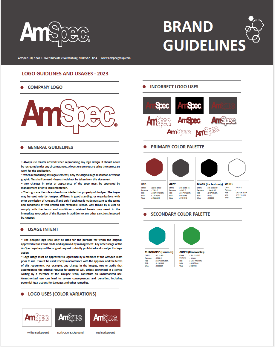
Logo: Viewed as outdated in style and typography; options ranged from a light refresh to a full redesign.
Tagline: None in place; two strong candidates emerged, each supporting different aspects of the brand story.
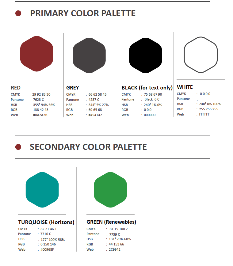
Colour Palette: The existing palette lacked modernity. A deep red—already used on the website—offered a distinctive, ownable colour in a market where competitors rely heavily on yellow, orange, green, or turquoise.
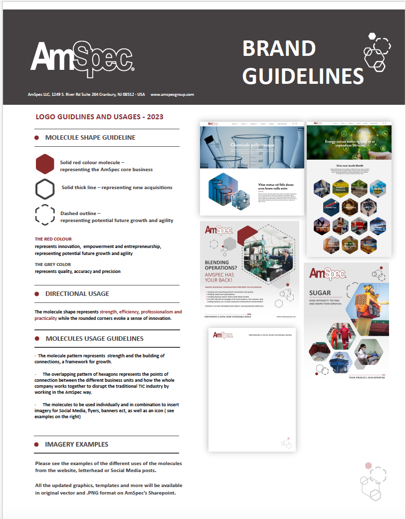
Iconography: Inconsistent and overly varied; needed simplification and standardization.
Typography: Required review to ensure clarity, modernity, and digital accessibility.
Brand Voice: Strong foundation in existing guidelines but needed refinement for consistency.
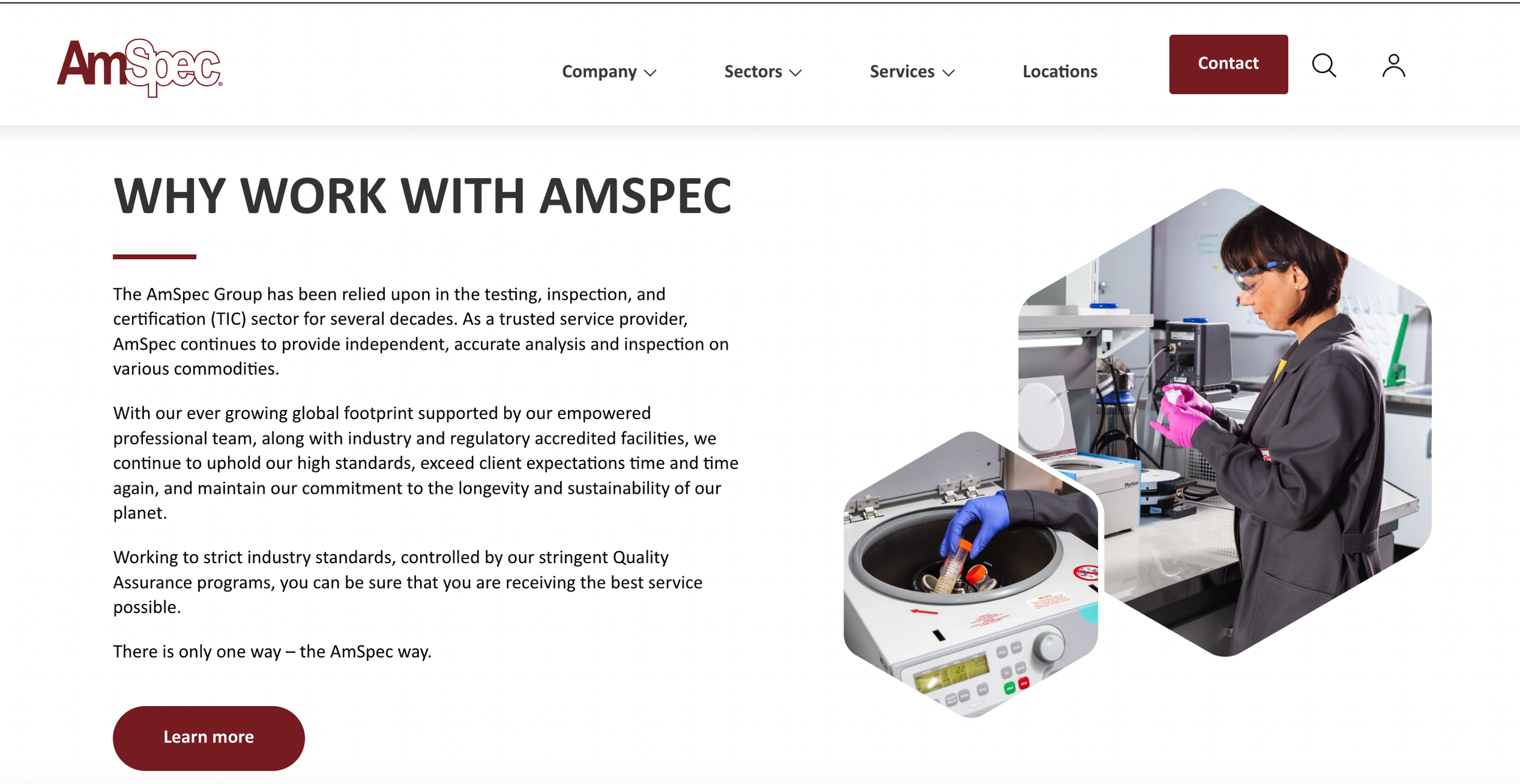
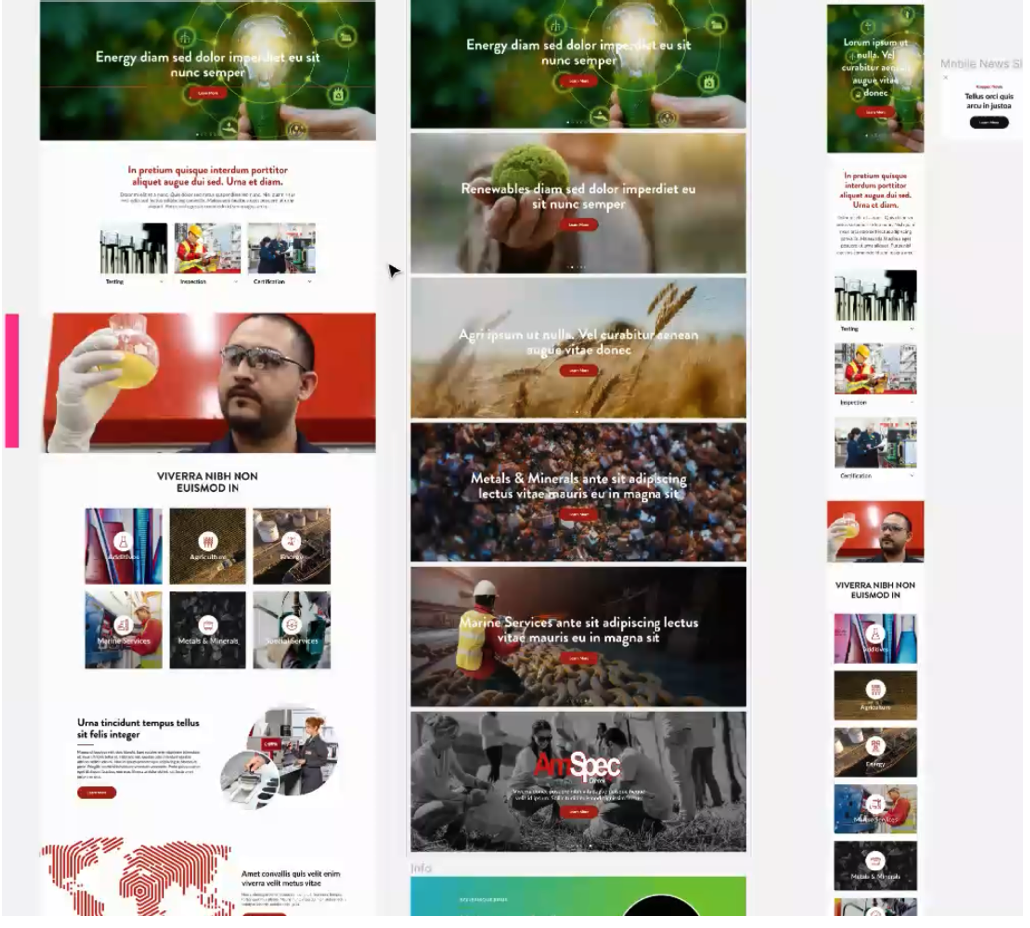
Website: Already in progress; rebrand decisions would influence final design and rollout.
These insights formed the basis for determining the scale of rebrand required—refresh, partial rebrand, or full transformation.
Strategy & approach
The team explored multiple pathways:
Brand Refresh: Modernize colours and refine the logo while keeping core elements intact.
Partial Rebrand: Update the logo, typography, and iconography while maintaining continuity with the existing brand.
Full Rebrand: Create an entirely new identity to reflect a bold new direction.
Competitor analysis played a key role, demonstrating how strong visual systems help companies communicate authority and clarity. The strategy emphasized differentiation through a confident colour palette, simplified iconography, and a unified tagline that could anchor future campaigns.
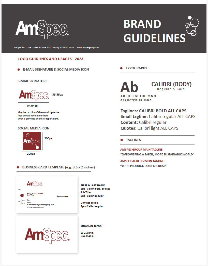
Creative development
The Amspec Management had been with the company since inception and were strongly aligned with the existing branding. It was decided that the ‘Amspec Red’ would remain but would be updated by choosing a slightly darker, more sophisticated tone and refining the black to a neutral grey to reduce the harshness of the black/grey dynamic.
Updated logo concepts with modern typography and optional icon integration
Refined colour palettes centered around a deep, sophisticated red paired with neutral greys
Streamlined iconography systems to replace inconsistent legacy symbols
Tagline lockups to ensure consistent use across digital and print assets
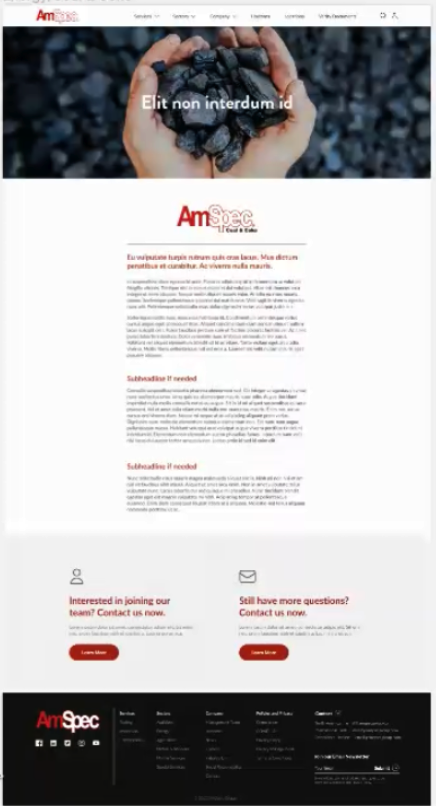
Website design enhancements aligned with the new visual direction
Creative examples from industry leaders helped illustrate how a cohesive system could elevate AmSpec’s presence and reinforce trust.
Design exploration
Creative Development
Creative Development
Implementation Plan
The rebrand rollout was structured in phases:
Finalize brand identity decisions (logo, colours, typography, tagline)
Develop brand guidelines covering voice, visuals, and usage rules
Update website design in collaboration with Black Hawk
Apply new branding across marketing materials, digital platforms, and sector-specific assets
Introduce the rebrand internally to ensure alignment and adoption
Launch externally with clear messaging about AmSpec’s evolution
Final Thoughts
AmSpec’s rebranding initiative represents more than a visual update—it’s a strategic realignment of the company’s identity with its future ambitions. By modernizing its brand system, clarifying its message, and strengthening its visual presence, AmSpec is positioning itself to stand out in a competitive global market while staying true to the values that built its reputation.