
Case Study: Advance Health Care Planning on HealthHub.sg
The Challenge
Singapore’s rapidly ageing population needs clearer, more accessible guidance on eldercare and end-of-life planning. While Singapore’s national digital healthcare platform, HealthHub.sg, provides significant health information, it lacks a dedicated space for these sensitive topics. As a result, many Singaporeans are unaware of Advance Care Planning, struggle to find trustworthy and culturally sensitive resources, and lack a centralized, user-friendly platform to support informed decision-making for themselves and their families.
“For adult-children, providing financial support and assistance with housework is an expression of fulfilling a filial obligation — but for elderly parents it may generate feelings of guilt and shame about being reliant on family members and lacking independence.”
Nuria Ling .
Role: UX Research & Design
Tools: Figma, Figjam, Miro
Team: 1 UX Designer (myself)
Deliverable: High-fidelity prototype integrated within HealthHub.sg
Project Duration: Jan 2025 - April 2025
The Solution
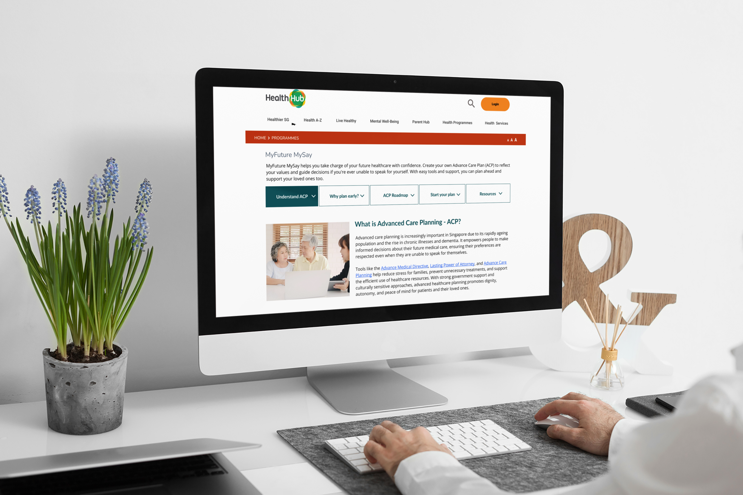
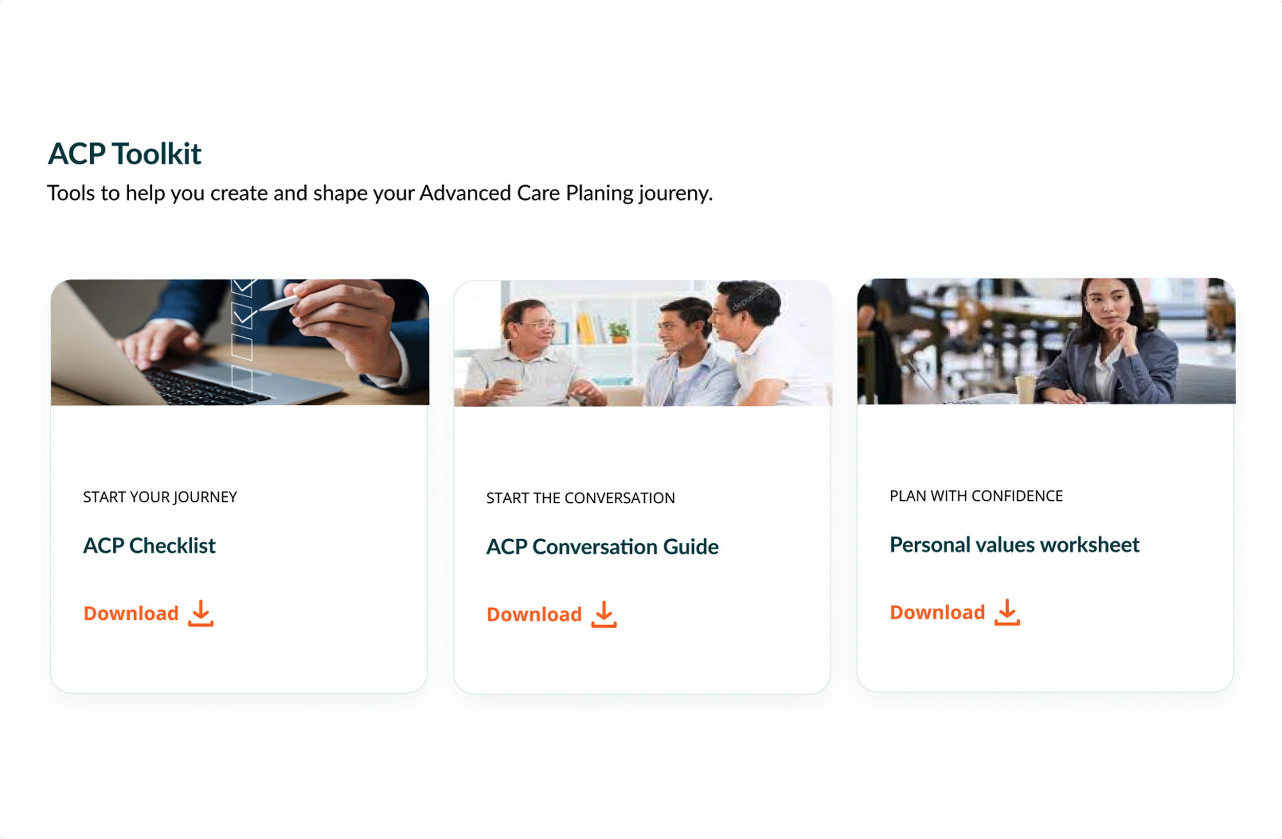
To address this gap, I designed a new “Eldercare & Advanced Healthcare Planning (AHP)” section on HealthHub.sg. The goal was to create a safe, accessible, and culturally sensitive digital space that helps Singaporeans learn about care options, start important conversations, and make informed decisions.
The design focuses on empathy, clarity, and usability — providing step-by-step guidance, links to legal and medical tools like Advance Medical Directives (AMDs), consolidation of information and a focus on cultural sensitivity.
The Scope
Over the four-month project, I led the end-to-end UX process — from research and synthesis to information architecture, wireframing, and usability testing.
This case study explores how I designed a simple, easy-to-use experience for an older audience around a sensitive and often-overlooked topic — ageing and end-of-life planning in a society shaped by diverse cultural beliefs and taboos.
Research
To uncover user needs and barriers, I did both qualitative interviews and secondary research with Singapore residents, caregivers, and healthcare professionals. I also analysed similar platforms such as MyLegacy.sg and U.S. and Australian based advance care planning sites, as well as culturally specific care planning sites to discover best practices and usability gaps. The research showed not just functional barriers but also deep emotional and cultural influences specific to Singapore that shape user behaviour.

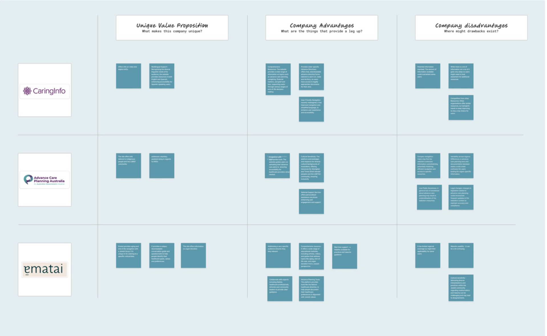
Competitors analysis
Doing a competitor analysis allowed me to understand industry standards, identify gaps and opportunities and explore the potential for cultural care planning.

In person interviews
I interviewed six people from diverse cultural backgrounds within Singapore to understand their views on Advance Healthcare Planning, uncovering key needs and pain points that helped me shape my solution.
“In most Asian cultures there is an aversion towards talking about death or illness for fear that it would bring bad luck”

Affinity mapping
Affinity mapping helped to organize and synthesize my user research insights, revealing patterns and themes that informed my design decisions.
Key findings:
Cultural reluctance to discuss end-of-life matters
Many users felt uncomfortable discussing topics related to death or old age. This taboo leads to avoidance, even when practical planning could help reduce stress for families.
01
Information fragmentation
Confusion over where to start and where to go for the correct information due to resources being spread across different government sites.
02
Low visibility of legal tools
Very few users knew about AMDs or how to sign up. The MyLegacy portal offered great guidance but was hard to find and access.
03
Shifting caregiving dynamics
As more seniors live independently or with limited family support, there’s a growing need for clear, modern information about alternative care options such as assisted living or community-based support.
04
Need for reassurance and clarity
Users wanted language that felt compassionate and non-technical — something that respected the sensitivity of the topic while staying easy to navigate.
05
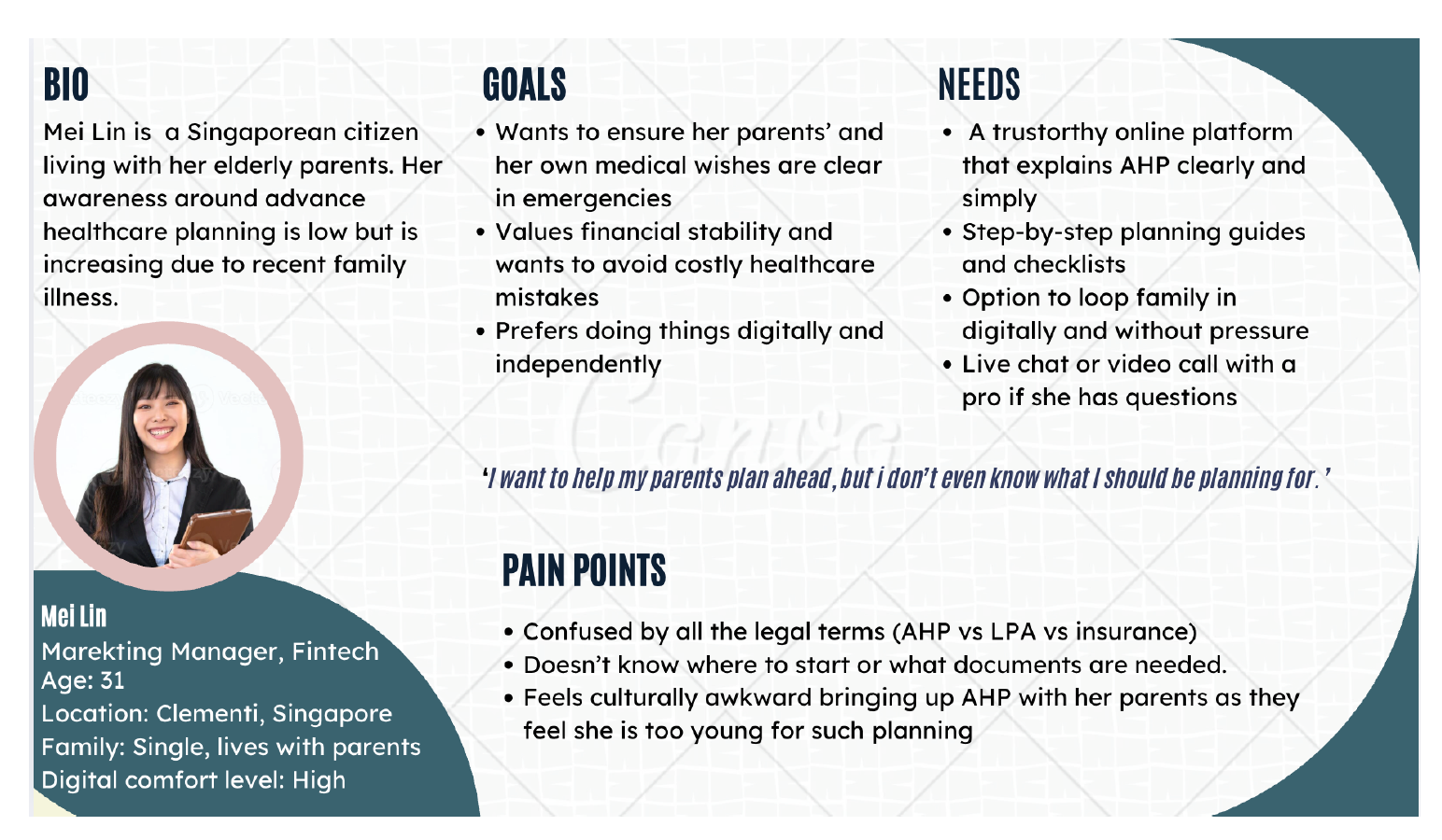
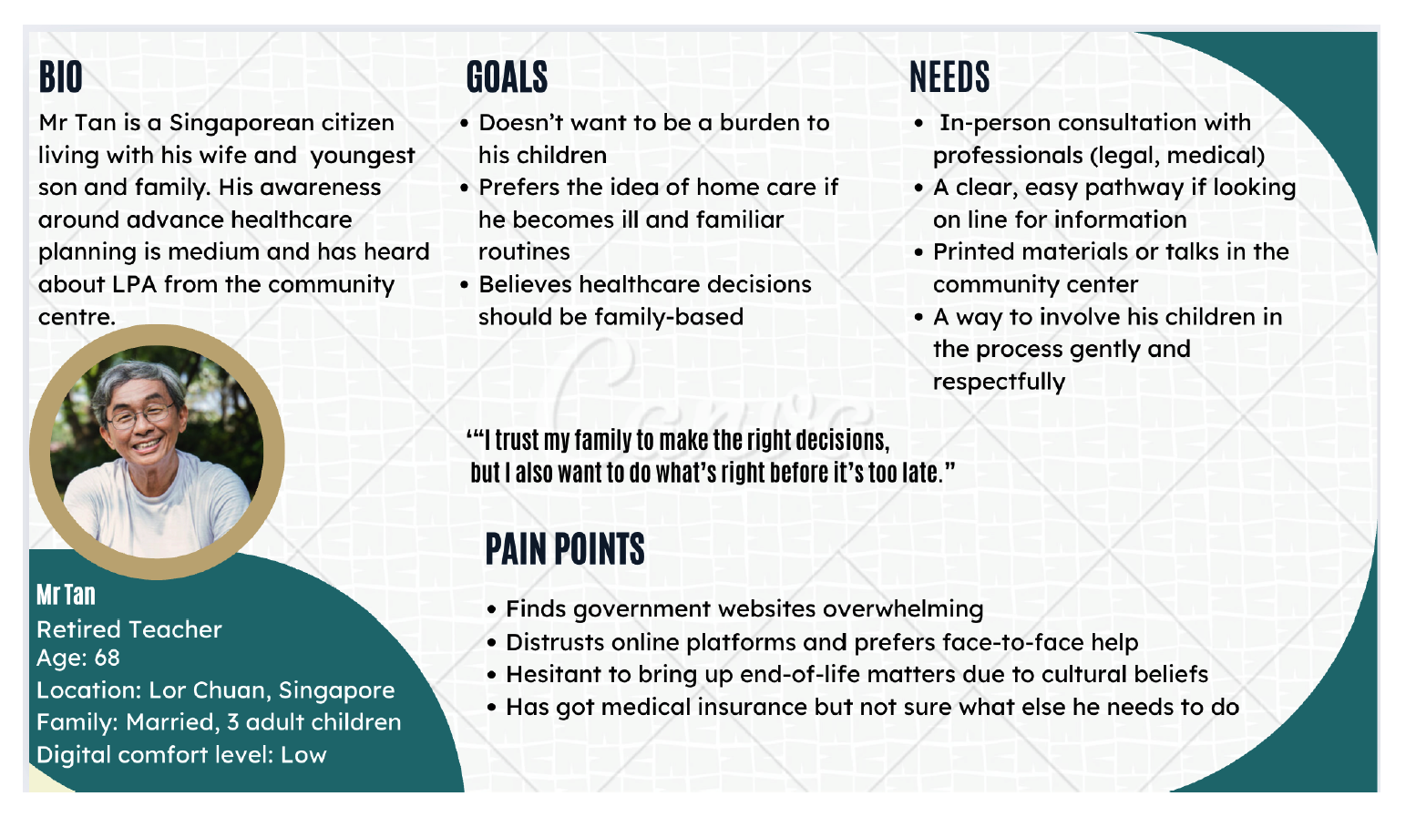
From these insights, I developed two personas to guide design decisions:
Mei Lin, 31 – The Family Planner: Living at home with elderly parents and balancing work and caregiving, she wants clarity and guidance on care options for her parents.
Mr. Tan, 68 – The Independent Senior: Values autonomy but feels unsure where to start when thinking about end-of-life preferences.
Personas
Ideation process
Guided by the research, I explored how to design a space that delivered on education but did not overwhelm and was also structured but empathetic and culturally sensitive.
Key design priorities that emerged:
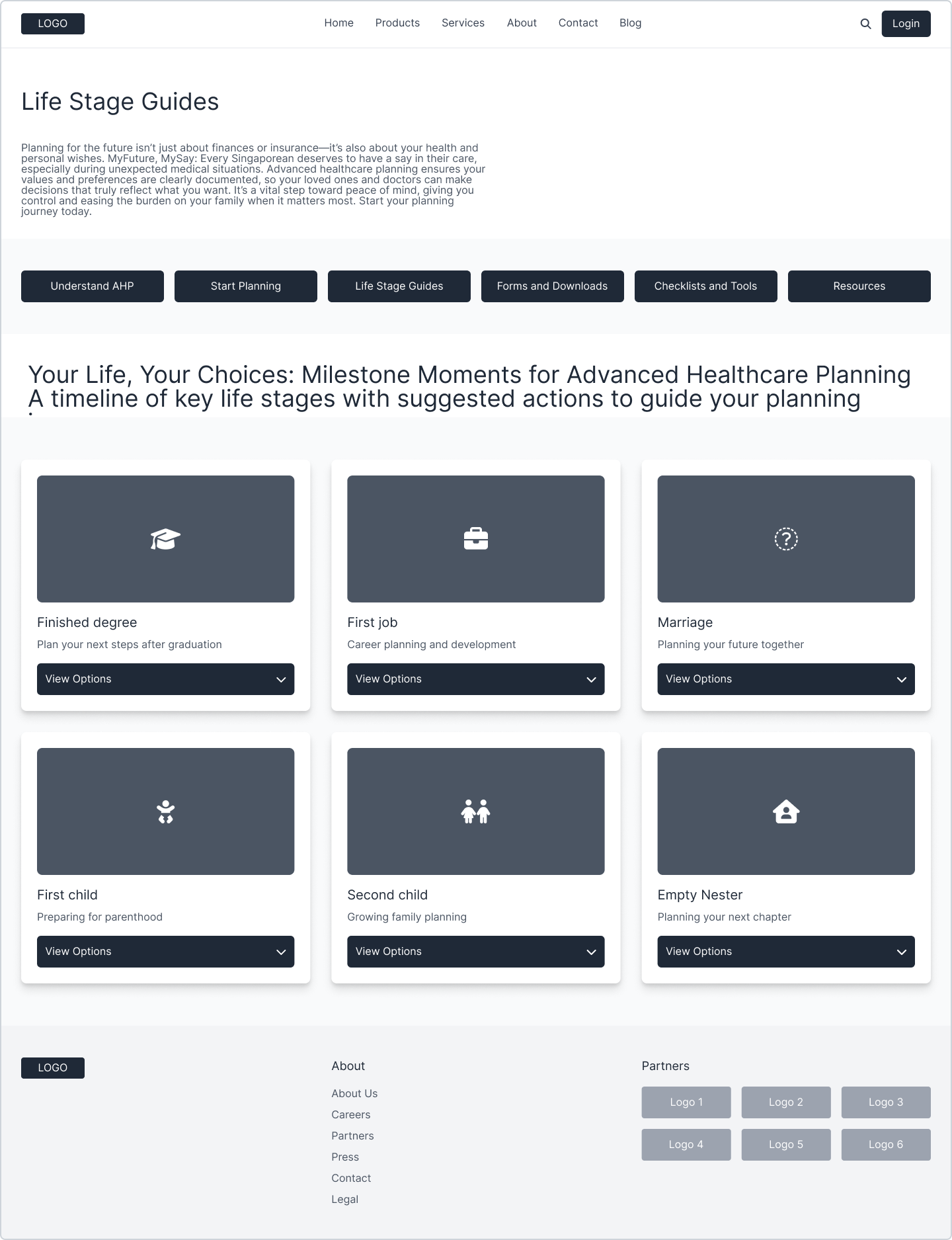
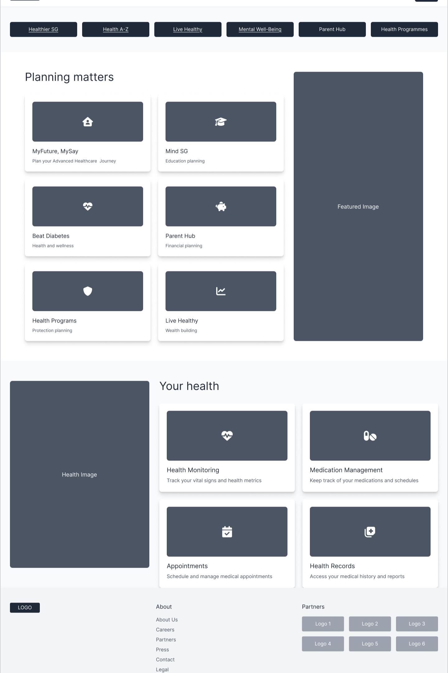
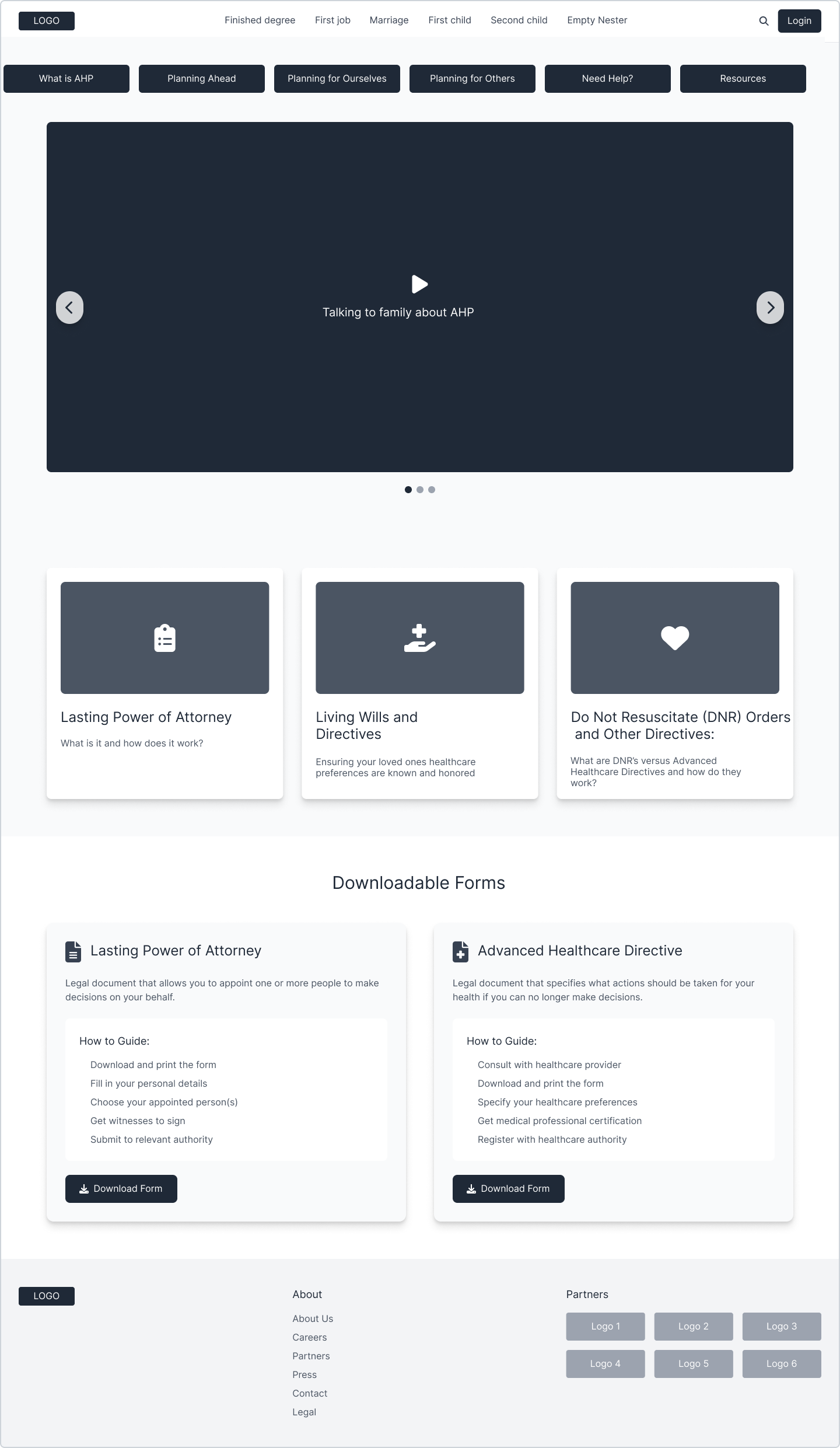
Centralized navigation connecting all eldercare topics in one place
Guided “journeys” through planning topics (care options, legal documents, conversations)
Clear calls to action linking to MyLegacy and AMD forms
Simplified, culturally sensitive copy and visuals
Accessibility for older users with larger typography, high contrast, and simple interactions
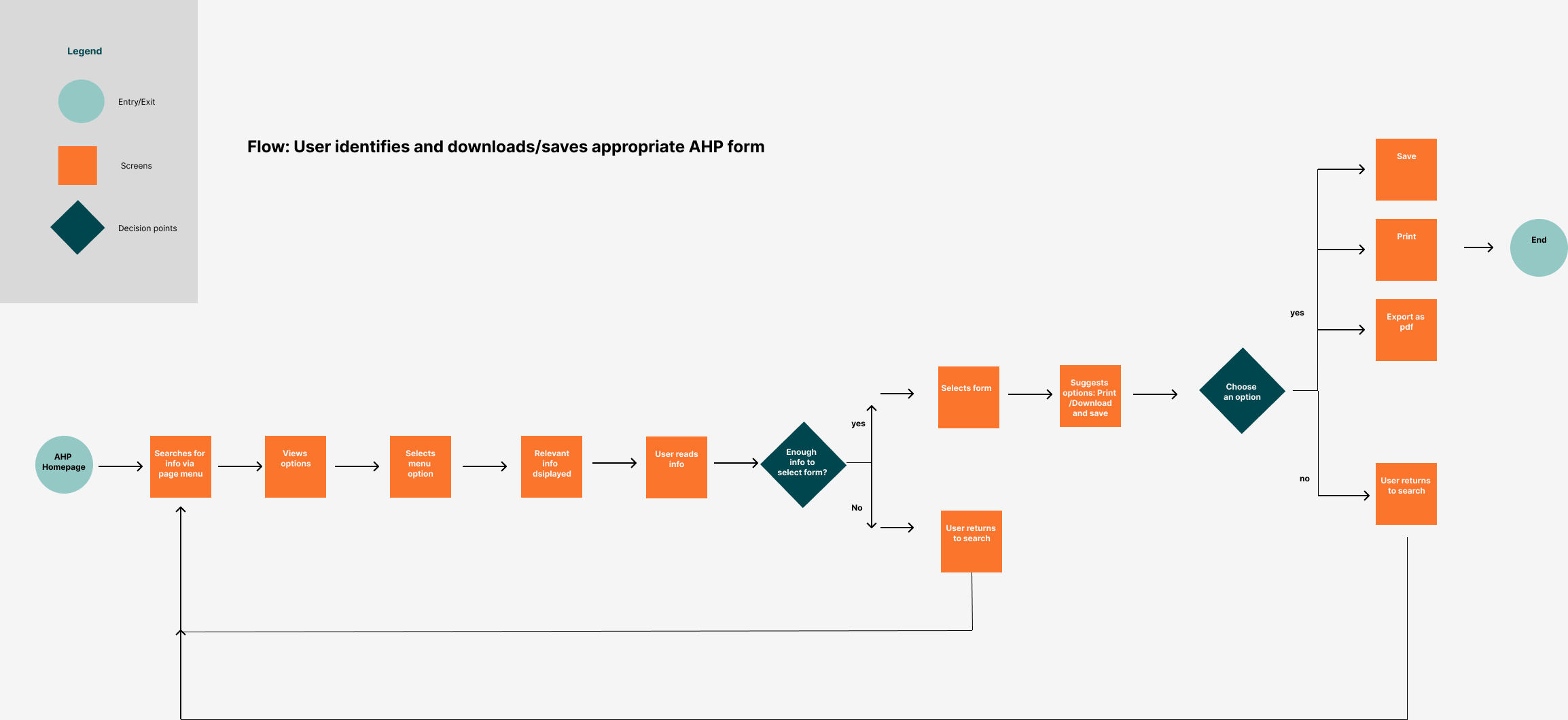
I developed user flows and low-fidelity wireframes to visualize how users would explore the new section and access personalized guidance.
Usability testing
I conducted usability testing with six participants (caregivers, middle-aged adults, and seniors) using mid- and high-fidelity prototypes. The goal was to test understanding, emotional tone, and ease of navigation.
What worked well:
Clear, step-by-step navigation for planning
Compassionate tone that helped people feel comfortable around the topic
Strong connection between HealthHub and already existing external resources
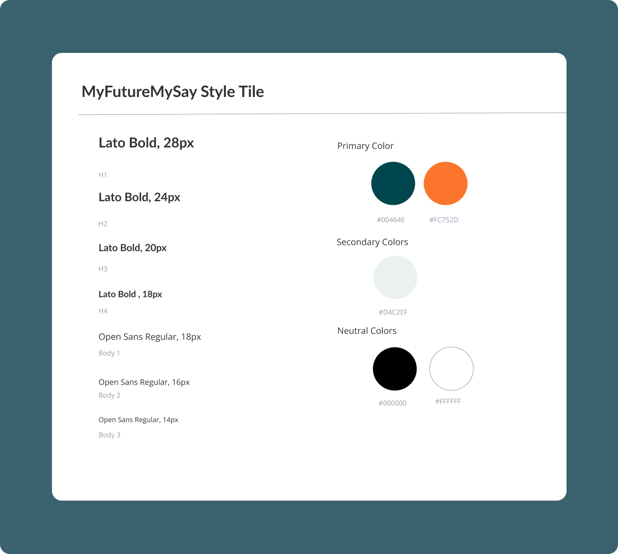
Simple layout and calming colour scheme (dark green and orange)
Areas to improve:
Make the terminology easier to understand (e.g., replace legal jargon with everyday phrasing)
Use pictures and quotes from professionals or families to add reassurance
Call-to-action buttons need to be at the top of the information hierarchy
Headings and navigation needed work to make the flow of information clearer
Design approach
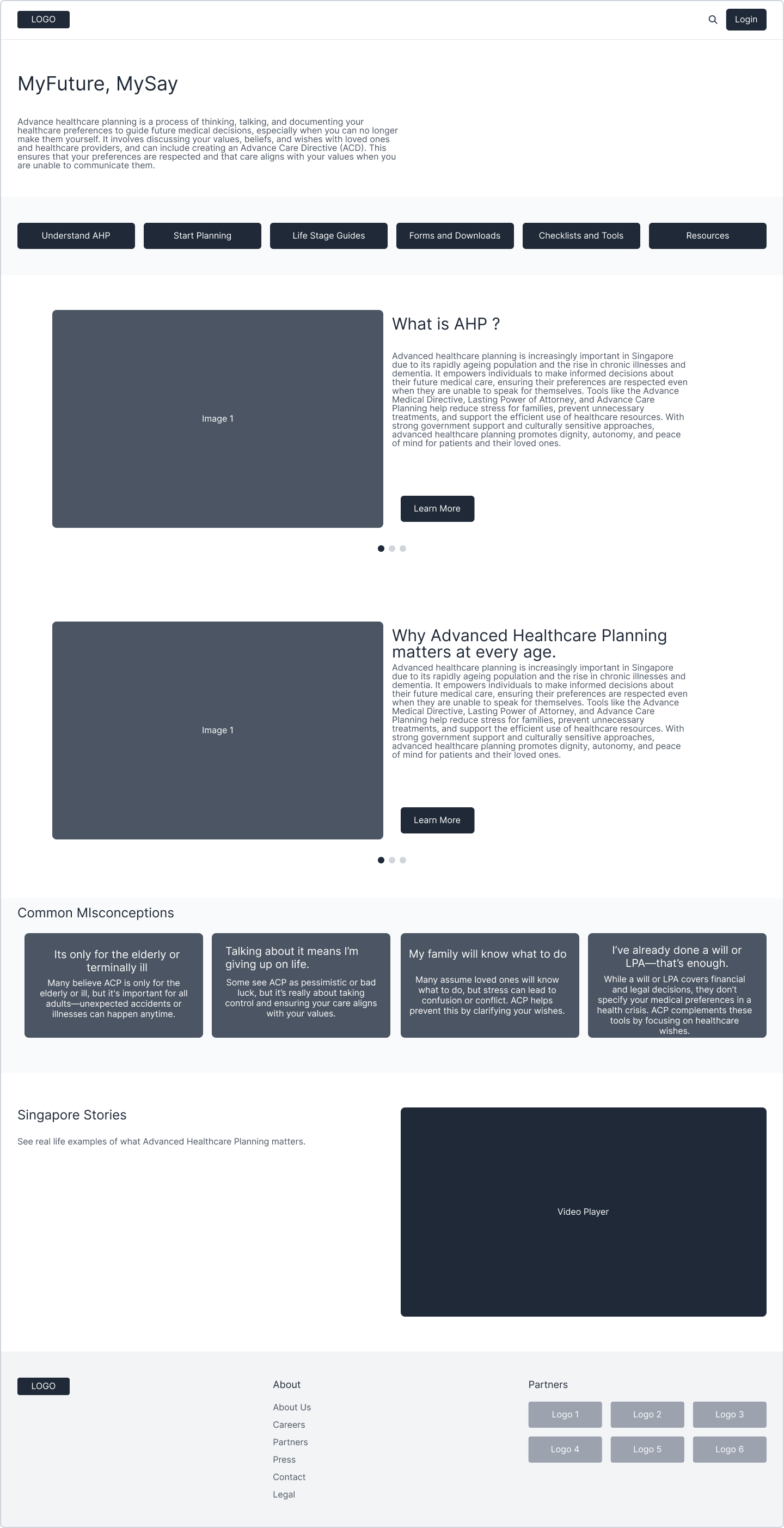
My design focused on making things clear and approachable, following the idea of “clarity through compassion.”
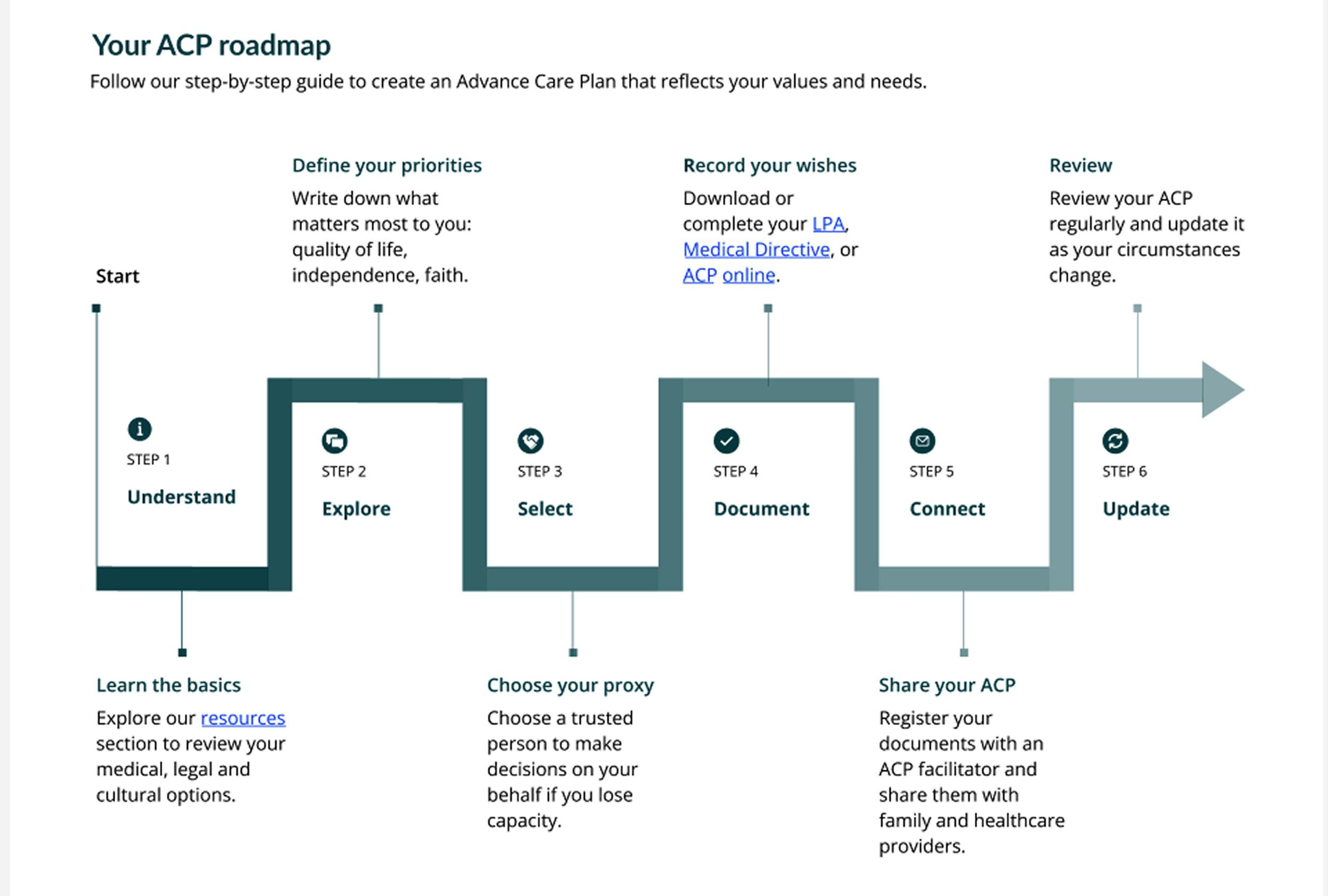
Information Architecture: Based on life stages and what users want to do — Learn, Plan, Act with clear CTA’s
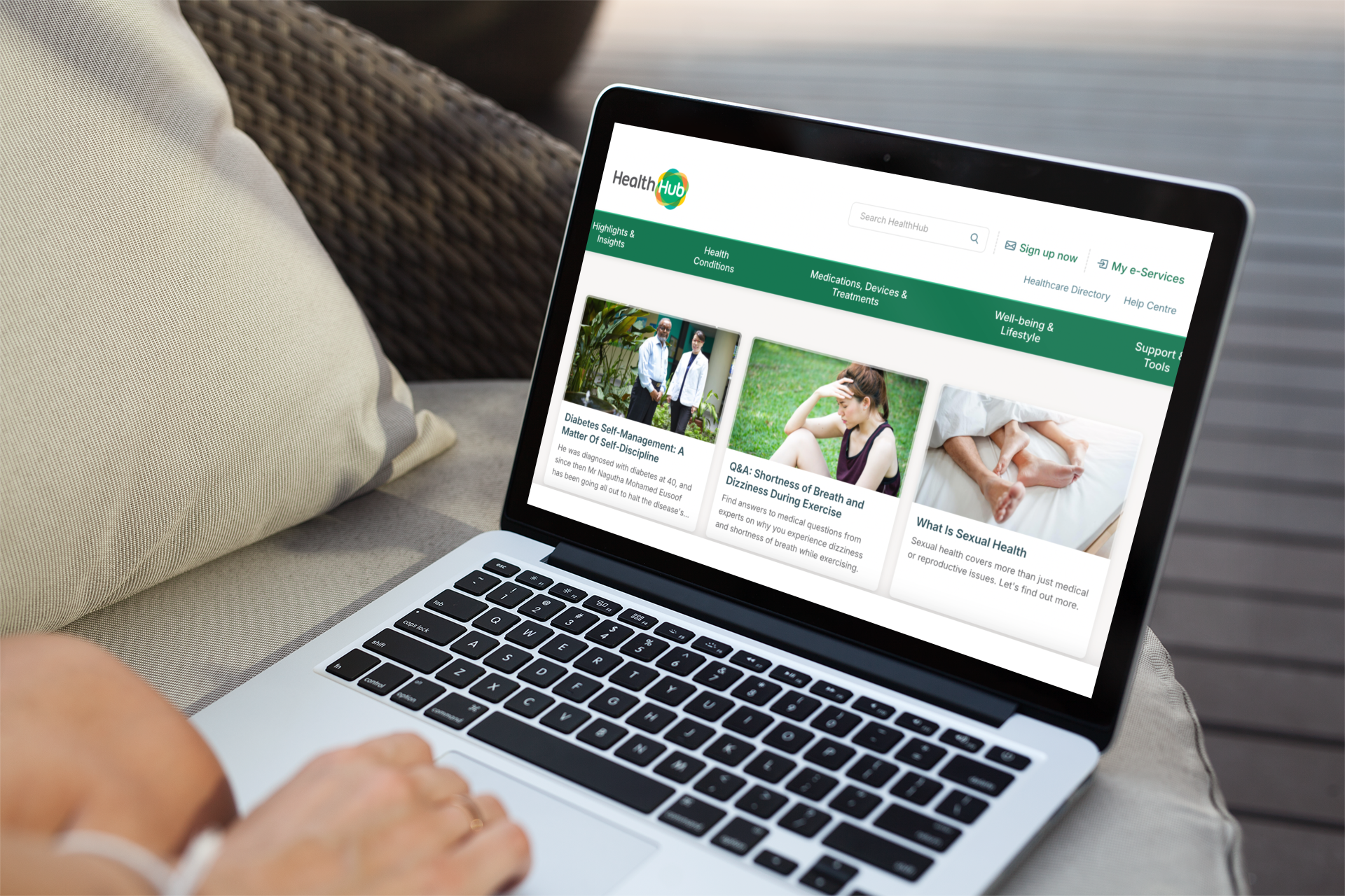
Look and feel: Simple, clean layouts with warm colors (dark green and orange) to feel trustworthy and hopeful, while still staying within the brand ‘look and feel’. The HealthHub website is particularly complex with no one set of branding guidelines as can been from the imagery
Text style: Large, easy-to-read fonts for all ages
Tone: Supportive and non-judgmental, avoiding fear-based messaging
The result is an experience that feels helpful and educational, not confusing or intimidating and encourages return visits and action.
Impact
Testing showed that users felt more confident and better informed about their care options after exploring the prototype.
5 out of 6 participants said they would revisit the page or share it with family.
Participants described the experience as “reassuring,” “easy to understand,” and “something every Singaporean should have access to.”
Increased awareness of AHD and the importance of planning as well as AMD downloads was identified as a key measurable success metric.
Users highlighted the clear roadmap, accessible language, and culturally sensitive content as major strengths,
Feedback also revealed opportunities for improvement, including clearer headings, key information placed above the fold, and more positive imagery.
Design priority 1:
Build Cultural Sensitivity and Emotional Trust
To address the cultural discomfort surrounding end-of-life conversations in Singaporean families, the solution needed to create a safe, empathetic, and non-intimidating space to normalise conversations in this space. This was done by offering resources like conversation guides, videos explaining the process, exploring the benefits of planning ahead and busting the myths around AHP.
Design priority 2:
Clear guidance for a complicated topic
Because awareness of AHP is low and information is spread across many platforms, the experience needed to simplify complex medical/legal topics and guide users, many of whom are not digitally literate, step-by-step through their options in a way that feels clear, actionable, and digestible.
Final Thoughts and takeaways
Working within HealthHub.sg inconsistent branding was a real design challenge—it pushed me to create a cohesive look and feel where none existed. Through this project, I learned how important it is to match design elements with user expectations. Understanding how people read buttons, links, and layouts has become has become a key skill I now carry into every design project.
This project demonstrated that regular feedback is vital when designing for nuanced, complex subjects. At its best, design can create space for real conversations, and accessibility can go beyond visuals to include emotional and cultural needs. Ultimately, this project showed me how thoughtful design can make government services feel more human and genuinely helpful.